


Pantone View Home + Interiors 2015
2014.07.30
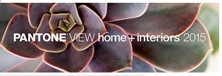
Pantone has today released Pantone View Home + Interiors 2015, a compendium of major color trends that will influence the home and interiors marketplace in 2015.
The report features nine key trend palettes, including Style-Setting, Abstractions, Botanicum, Zensations, Urban Jungle, Tinted Medley, Past Traces, Serendipity and Spontaneity, plus individual color and material direction.
"Consumer preferences, behaviors and lifestyles are constantly evolving spawning a desire for fresh color palettes in both home and interior design," commented Leatrice Eiseman, executive director of the Pantone Color Institute. "While rigid color rules have been replaced by more creative guidelines, style and color coordination in the home remains a consistent goal. The PANTONE VIEW home + interiors 2015 forecast can validate some pre-conceived color choices, while also giving new color inspiration and direction."
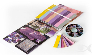
Pantone View Home + Interiors 2015 contains visual inspiration, suggested color harmonies, individual tear-out palette cards for each of the nine forecasted palettes, swatches of the 72 forecasted colors, and images from the forecast for use in presentations and storyboards.
Style-Setting
As high fashion is often a forerunner to styling for home furnishings in line, design, texture and color, the taste-making palette called Style-Setting is all about poise, finesse and polish. The elegance of the purple family adds a dramatic interplay against classic mahogany, off-white, gray and taupe, along with subtly shimmering frosted almond and champagne beige.

PANTONE 14-1012 Champagne Beige
PANTONE 19-3325 Wood Violet
PANTONE 19-1420 Deep Mahogany
PANTONE 18-3224 Radiant Orchid
PANTONE 18-4005 Steel Gray
PANTONE 13-1012 Frosted Almond
PANTONE 17-1311 Desert Taupe
PANTONE 11-1001 White Alyssum
Abstractions
Abstractions unleashes the inner artist, similar to the formulation of abstract art where styling might seem randomly gathered, forming a mosaic of differing shapes and many of them geometric. Colors such as grape and apricot, dahlia red, stonewashed blue, hazel nut brown and vineyard green seem to come from equally disparate places, but when brought together create an artistic whole.

PANTONE 16-1518 Rosette
PANTONE 19-1555 Red Dahlia
PANTONE 19-4342 Seaport
PANTONE 19-4342 Crushed Grape
PANTONE 17-1143 Hazel
PANTONE 14-1120 Apricot Illusion
PANTONE 17-3917 Stonewash
PANTONE 18-0117 Vineyard Green
Botanicum
Botanicum is a palette lifted directly from the complexities of flora and foliage, forming intriguing groupings filled with succulent shadings of green, grape and café au lait, most often counter-balanced with dusty or smoky tones of blue and orchid. When used together, a sophisticated, yet inherently natural palette emerges.

PANTONE 16-0840 Antique Moss
PANTONE 16-4010 Dusty Blue
PANTONE 18-1710 Grape Nectar
PANTONE 17-1227 Café au Lait
PANTONE 17-3612 Orchid Mist
PANTONE 18-3410 Vintage Violet
PANTONE 15-2210 Orchid Smoke
PANTONE 17-0207 Rock Ridge
Zensations
The palette titled Zensations truly engages and heightens the senses as it displays a literal "enlightenment" by taking the thoughtful, meditative qualities of the blue and blue-green family to more visceral level by adding a compelling red, an atmospheric green as well as sparkling silver and gold.

PANTONE 15-0927 Pale Gold
PANTONE 14-5002 Silver
PANTONE 19-3810 Eclipse
PANTONE 19-3952 Surf the Web
PANTONE 17-4139 Azure Blue
PANTONE 19-4526 Blue Coral
PANTONE 19-2033 Anemone
PANTONE 17-6212 Sea Spray
Urban Jungle
An Urban Jungle transforms rustic chaos into something "civilized" and sylvan - speaking more of big city living than that of a wild terrain. Rather than consistently rough textured, contours are smoother and colors a combination of both typical and atypical jungle hues. Warm animal skin tones are set against the modernity of deep blue-greens, a vibrant greenish yellow, plus black and white.

PANTONE 18-4718 Hydro
PANTONE 14-0740 Bamboo
PANTONE 17-1340 Adobe
PANTONE 18-1447 Orange Rust
PANTONE 16-0940 Taffy
PANTONE 13-1009 Biscotti
PANTONE 19-4008 Meteorite
PANTONE 11-0601 Bright White
Tinted Medley
Tinted Medley is truly a harmonious composition of closely related, deliciously warm tones with peach and pink striking the main chord. Bellini, apricot wash, peach amber and macadamia are compatible blends, while powdered roses and yellows underscore and support the perfect pitch of an ethereal rosy-taupe.

PANTONE 14-1506 Rose Smoke
PANTONE 12-0619 Dusty Yellow
PANTONE 13-1114 Bellini
PANTONE 14-1230 Apricot Wash
PANTONE 15-1506 Etherea
PANTONE 14-1316 Dusty Pink
PANTONE 15-1423 Peach Amber
PANTONE 12-0709 Macadamia
Past Traces
Past Traces honors history in the home, holding on to some vestige of the past is deeply satisfying and reassuring. The look ranges from gently worn to contemporized adaptations - still many of the colors with names like pastel parchment, cameo green, faded denim and dusty cedar, capture a vintage feel.

PANTONE 11-0603 Pastel Parchment
PANTONE 15-1516 Peach Beige
PANTONE 14-6312 Cameo Green
PANTONE 17-4021 Faded Denim
PANTONE 16-1406 Atmosphere
PANTONE 15-4712 Marine Blue
PANTONE 18-1630 Dusty Cedar
PANTONE 18-0328 Cedar Green
Serendipity
The literal meaning of Serendipity is "a pleasant surprise" or "a happy accident." In the parlance of styling, it is the coming together of unlikely designs and unexpected colors. An outgoing orange engages cool eggshell blue, while bright chartreuse is enhanced by a yellow gold and hot pink embraces a lofty scarlet - all under the watchful gaze of a tiger's eye taupe.

PANTONE 16-1363 Puffin's Bill
PANTONE 19-1559 Scarlet Sage
PANTONE 17-2036 Magenta
PANTONE 17-3020 Spring Crocus
PANTONE 14-4809 Eggshell Blue
PANTONE 17-1038 Tiger's Eye
PANTONE 14-0445 Bright Chartreuse
PANTONE 15-1050 Golden Glow
Spontaneity
Irrepressible fun is what the Spontaneity palette delivers. Just as the name implies, it is the stuff that spur-of-the-moment, impulse buying is all about, with whimsical design and unique color mixtures a large part of the attraction. Happy hues of Sunkist coral, marigold and delicious cantaloupe are complemented by the exuberance of kelly green and floral accents of hyacinth, violet quartz, winsome orchid or misty jade.

PANTONE 14-3206 Winsome Orchid
PANTONE 17-1736 Sunkist Coral
PANTONE 13-6008 Misty Jade
PANTONE 15-1239 Cantaloupe
PANTONE 14-1050 Marigold
PANTONE 17-3619 Hyacinth
PANTONE 18-1720 Violet Quartz
PANTONE 16-6138 Kelly Green
Source: Dexigner
About JINHAN FAIR
JINHAN FAIR for Home & Gifts(Poly Spring/Autumn Fair Phase Ⅱ) is a leading international trade platform organized by Poly Exhibition. Established in 2000, JINHAN FAIR has been successfully held for 53 editions and is recognized as one of China's most established sourcing fairs for the home and gifts industry. JINHAN FAIR is also the only Union of international Fairs-approved export trade fair in the home & gifts sector in China.
The 54th Jinhan Fair
Jinhan Fair Online Exhibition


 Visitor Registration
 Booth Application