


Decorating with Pantone’s Top 10 Summer Colours
2014.07.24
Industry colour expert Pantone is known for its uncanny ability to forecast the hottest colour trends each season, year in and out. Pantone’s 2014’s Colour of the Year, Radiant Orchid, a moody and ethereal pinkish-mauve, has turned heads on runways and inside homes. The colour institute’s Spring/Summer 2014 trend report identifies 9 additional Pantone colours to complement Radiant Orchid.
Looking for design inspiration? Incorporate Pantone’s top 10 summer colours into your interior space. Here are Pantone’s top 10 summer colours, and ideas for using them in your window treatments.
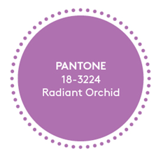
Pantone colour: Radiant Orchid (Pantone 18-3224)
Window treatment suggestion: This sensuous, luminous hue calls for luxe silk taffeta, perfect for voluminous drapes or, for a crisper look, tailored Roman shades.
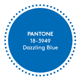
Pantone colour: Dazzling Blue (Pantone 18-3949)
Window treatment suggestion: This look-at-me blue is perfect in a high-contrast print, fabric for blinds or drapery panels. Think summer’s nautical stripes, graphic trellis pattern or classic toile.
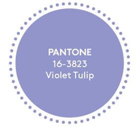
Pantone colour: Violet Tulip (Pantone 16-3823)
Window treatment suggestion: Modern and distinctive, this hue was made for rich, tactile velvet drapery, ideally with a complementary tufted headboard if used in the bedroom.
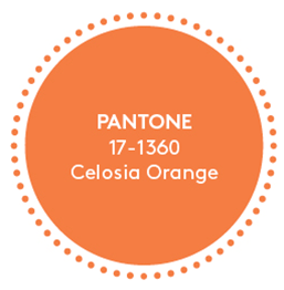
Pantone colour: Celosia Orange (Pantone 17-1360)
Window treatment suggestion: A warm orange that’s perfect as a morning pick-me-up, consider this hue perfect for a compact bathroom blind or a sleek little valance over the kitchen window.
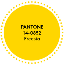
Pantone colour: Freesia (Pantone 14-0852)
Window treatment suggestion: Another natural for summer 2014’s trendy prints and patterns, this midrange yellow can hold its own against greens, blues and black. Think: home office Roman shades or a valance paired with a natural fibre rolling blinds.
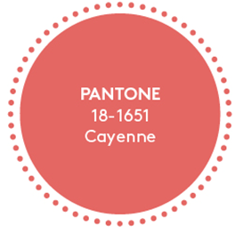
Pantone colour: Cayenne (Pantone 18-1651)
Window treatment suggestion: A peppy, cheerful hue that’s great for a feminine bedroom window. Think linen drapery panels, barely touching the floor and swaying gently in the breeze.
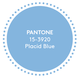
Pantone colour: Placid Blue (Pantone 15-3920)
Window treatment suggestion: This icy blue brings seasonal cool to the living room or even an indoor-outdoor sunroom.Crisp linen or cotton would be perfect!
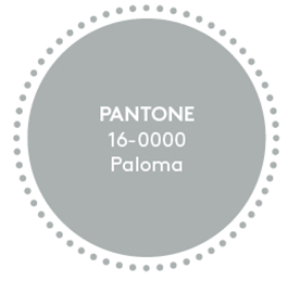
Pantone colour: Paloma (Pantone 16-0000)
Window treatment suggestion: A steely neutral, consider this a minimalist option in any fabric, for any private or public room in the house. Use eye-catching tiebacks or hardware to add some flash.
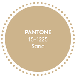
Pantone colour: Sand (Pantone 15-1225)
Window treatment suggestion: Another neutral, this hue would make for versatile blinds, Romans, drapery panels, and even sheer drapes for an outdoor pergola or dining area.
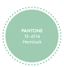
Pantone colour: Hemlock (Pantone 15-6114)
Window treatment suggestion: This relaxed sage-y hue has a vintage hue, perfect for today’s on-trend nurseries and kids’ rooms. It’s got character and holds its own as a solid, or in a pattern, especially this spring/summer’s much loved botanical prints.
Source: National Drapery
About JINHAN FAIR
JINHAN FAIR for Home & Gifts(Poly Spring/Autumn Fair Phase Ⅱ) is a leading international trade platform organized by Poly Exhibition. Established in 2000, JINHAN FAIR has been successfully held for 53 editions and is recognized as one of China's most established sourcing fairs for the home and gifts industry. JINHAN FAIR is also the only Union of international Fairs-approved export trade fair in the home & gifts sector in China.
The 54th Jinhan Fair
Jinhan Fair Online Exhibition


 Visitor Registration
 Booth Application