


These 13 Vintage Paint Colors Are Trending Again—And We Can See Why
2025.08.13
Lace Handkerchief (CSP-220) by Benjamin Moore
With 26 years of experience under her belt, Lisa Jenkins, certified architectural color consultant in Charlotte, North Carolina, has seen trending neutrals warm, cool, and warm again. A nod to the early 2000s, Jenkins describes Lace Handkerchief as “layered with pigments and complexity” and “beautiful paired with a warm white trim.”

Bancha (No. 298) by Farrow & Ball
If any color says “vintage,” Karon insists, it’s avocado green. “Bancha evokes the deep, earthy tone of a ripe avocado peel—a 1970s kitchen icon reborn for 2025,” she explains. “It’s trending now because it’s equal parts bold and sophisticated, and pairs beautifully with warm woods and natural textures.” If you’re not ready for avocado green kitchen cabinets, she recommends microdosing with picture frames or the feet of an accent chair.
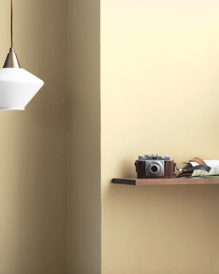
Coronado Cream (219) by Benjamin Moore
According to Lauren Battistini, chief color strategist at LFB Color Consulting and brand ambassador for Liberty Painting in Houston, Texas, butter yellow surpassed classic white in popularity back in 2012. “Its resurgence is indicative of our yearning for joy, positivity, and a little bit of sunshine in our lives and dwellings,” she says. Battistini recommends Coronado Cream specifically because “it isn’t too pale and contains just a dash of orange undertone.”

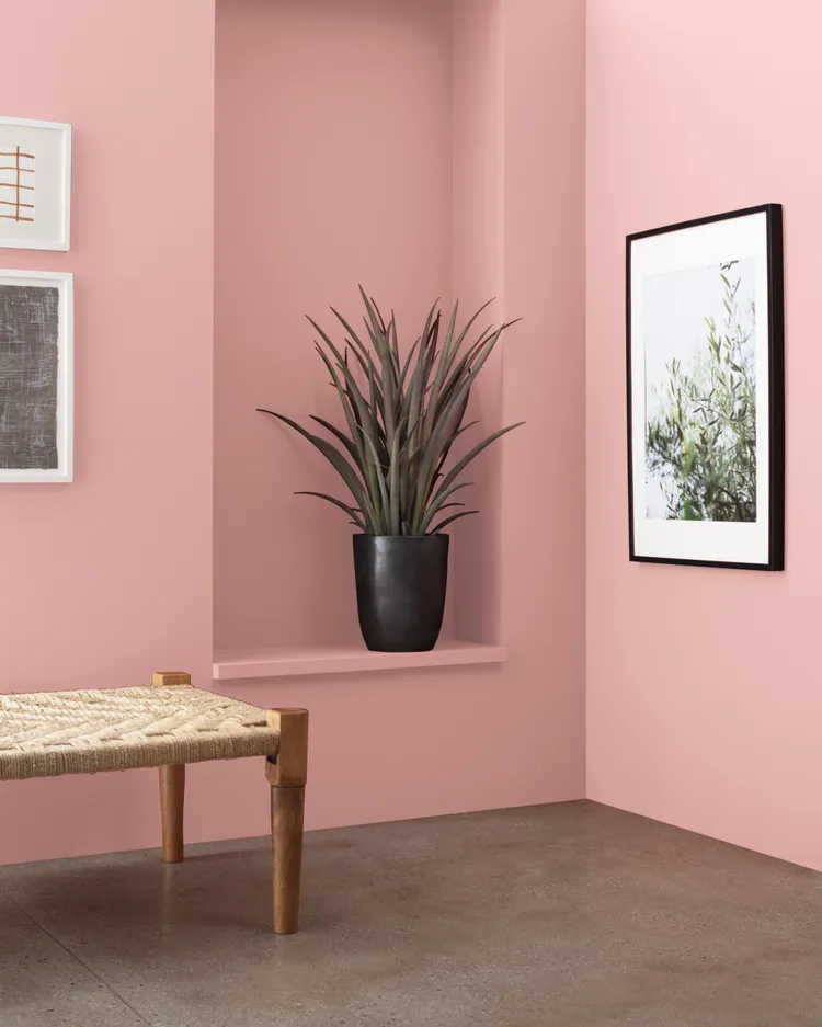
Dead Salmon (No. 28) by Farrow & Ball
“The walls of Victorian parlors were often painted dusty pink—Queen Victoria’s favorite color was mauve—and these colors reemerged in the 1980s,” Karon explains. “Today’s versions are softer and more livable.” Despite its unappetizing moniker, Dead Salmon is a favorite of both Karon and Jenkins that feels romantic without being precious. Jenkins recommends grounding the color with a deep bronze and some cozy cream boucle.

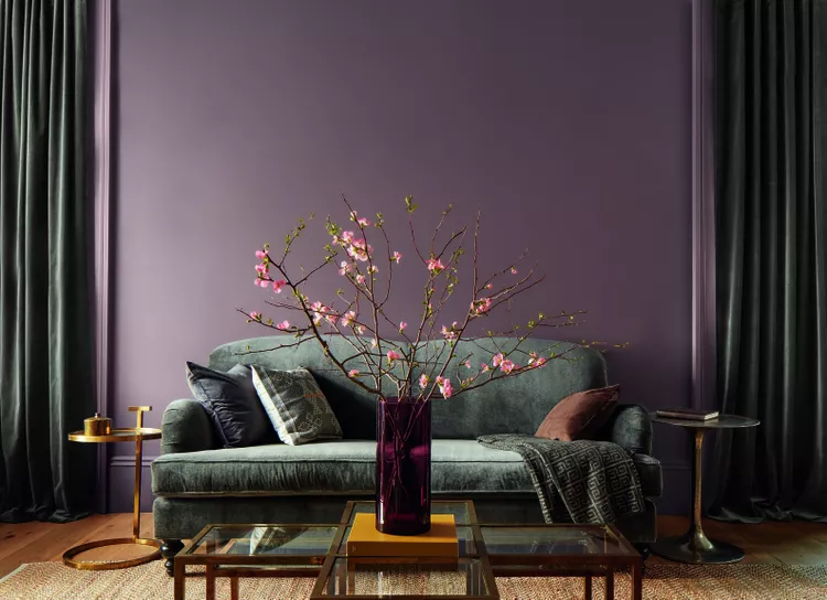
Plum Perfect (1371) by Benjamin Moore
The 1980s and 1990s invited a spectrum of purple shades into our homes, and today, we’re reigniting our relationship with the color. “Today’s purple has been warmed ever so slightly with a touch of red but maintains its brightness,” Battistini says. “People are looking to cultivate energy and creativity in their design choices, which makes this warm, mid-tone paint color the ideal fit.”

Dew Drop (9641) by Sherwin-Williams
“Soothing, powdery blues have been perennial favorites in kitchens and bathrooms since the early 20th century,” explains Karon. She describes Dew Drop as “a soft, delicate blue that feels classic yet current on everything from mudroom cabinets to bedroom walls to bathroom vanities.” To really make the color sing, she recommends using it with unlacquered brass.
Brighton Rock Candy (1291) by Benjamin Moore
During the preppy era, everyone loved punchy pink iconically paired with kelly green. Now, Battistini says, people are leaning more toward a warm pink that’s closer to peach. (And, according to Jenkins, perfect with emerald green, indigo, or even a mid-tone taupe.) “Without a doubt, it’s my favorite color family—inviting, happy, and high vibe,” Jenkins adds.

Weston Flax (HC-5) by Benjamin Moore
Though butter yellow most recently came back in 2012 before having a major moment again now, Karon insists “it was decorator Nancy Lancaster’s famous yellow drawing room, completed in the 1950s, that cemented the shade’s place in design history.” Weston considers Weston Flax one of her tried-and-true yellows for its sunny, cheerful disposition.
Cinnamon Slate (2113-40) by Benjamin Moore
It’s not a coincidence that this exact shade was named Benjamin Moore’s 2025 Color of the Year, but to Jenkins, it’s simply the deeper version of our grandmothers’ favorite: light mauve. “The wavelength is the same, but Cinnamon Slate is full of smokiness and introspection—it can make a room feel a little like it has hidden secrets,” she describes.

Naperon (No. 315) by Farrow & Ball
According to Karon, earthy, sunbaked terracotta tones were a calling card in 1970s interiors and Tuscan-inspired spaces of the early 2000s. Farrow & Ball introduced Naperon earlier this year, which feels modern yet nostalgic—“a rich hue that adds warmth to any room.”
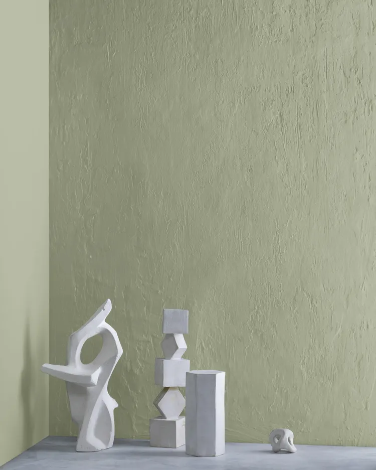
Weekend Getaway (473) by Benjamin Moore
“Calming, herbal greens were go-tos in post-war 1940s cottages, and saw a resurgence in the 1990s,” Karon explains. “Now, they’re back as the ultimate modern neutral—fresh yet understated.” She recently used Weekend Getaway in the living room of a client project, which created the perfect grounding backdrop for neutral furnishings and colorful abstract art.
Salamander (2050-10) by Benjamin Moore
The hunter green of the 1980s is back—but with a little less chroma. “It’s still full of pigment and complexity, but a little deeper and more sophisticated,” says Jenkins. “A muddier version of hunter green, Salamander always gets a standing ovation in a color drenched dining room or office.”

Timid White (OC-39) by Benjamin Moore
Before being edged out by crisp, cool whites in the early aughts, creamy whites dominated interiors in the 1980s and 1990s. Nowadays, Karon says, nearly all of her clients crave warmth. “I receive requests weekly for a warm white that isn’t too yellow,” she explains. “Timid White ticks that box—it’s bright but cozy and pairs beautifully with everything from dark antiques to modern, colorful accents.”
About JINHAN FAIR
JINHAN FAIR for Home & Gifts(Poly Spring/Autumn Fair Phase Ⅱ) is a leading international trade platform organized by Poly Exhibition. Established in 2000, JINHAN FAIR has been successfully held for 53 editions and is recognized as one of China's most established sourcing fairs for the home and gifts industry. JINHAN FAIR is also the only Union of international Fairs-approved export trade fair in the home & gifts sector in China.
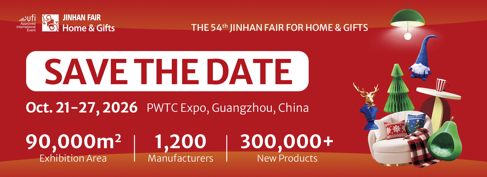
The 54th Jinhan Fair
Jinhan Fair Online Exhibition


 Visitor Registration
 Booth Application