


Valspar's 2026 Color of the Year Is the Calming Green We've All Been Waiting For
2025.08.13
If you've been craving a sense of calm for your home space, look no further than Valspar's 2026 color of the year, Warm Eucalyptus. The soothing green hue has warm undertones that resemble nature's restorative elements, which will further connect your interiors or exteriors to the outdoors.
"Warm Eucalyptus is an incredibly adaptable hue that can serve as a statement or a subtle anchor," Sue Kim, the director of color marketing at Valspar, tells The Spruce.
Whether you decide to completely color drench a dull room or pair it with another complementary shade to make a bold statement, we share all of Kim's best tips for welcoming this versatile color into your home.
Create a Sense of Comfort
Warm Eucalyptus will instantly hit you with a wave of nostalgia since it channels vintage palettes that can bring a familiarity of retro design. It reminds us to slow down in this fast-paced world and strive to find comfort in things that we all once loved and enjoyed.
People are being more intentional with how they decorate their space, so it feels restorative for them to return home and properly unwind without the chaos.
How to Use the Color in Your Home
Warm Eucalyptus can easily be used to refresh both home interiors and exteriors to boost curb appeal instantly.
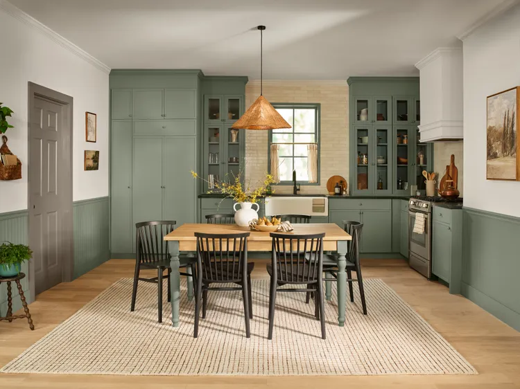
When it comes to home interiors, Kim recommends using the hue for color drenching in spaces like the bathroom or bedroom to create a calming, monochromatic look.
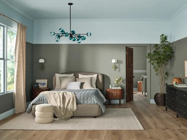
"For more visual interest, try double drenching by pairing Warm Eucalyptus on the lower two-thirds of a wall with a lighter complementary hue, like Degas Blue, on the upper third," Kim explains to The Spruce. "This creates a grounded yet uplifting effect."
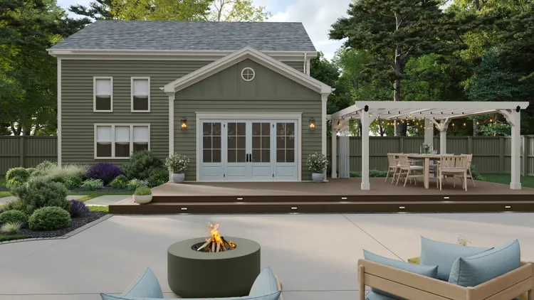
However, if you're looking to freshen your outdoor spaces, consider the warm color for entry doors, exterior siding, or patio accent walls, which will automatically harmonize with the outdoor living, Kim says.
Warm Eucalyptus can also be used to tackle smaller projects like bringing a dingy, old cabinet back to life or repainting an accent piece, so you'll actually want to use it.
"A variety of interior and exterior Valspar paints can be tinted to Warm Eucalyptus, making it easy to flex to suit both style and function across projects," Kim explains.
Other Colors to Consider
If you're looking for other colors to pair with Warm Eucalyptus to curate a well-rounded paint palette, Kim shares two others that will complement the earthy tone.
Degas Blue 8004-35B: This blue hue is breezy blue with gray and green undertones that have a soothing lightness, Kim says. She suggests using this watery color for upper walls and or ceilings in a color-blocked space.
Groundbreaking 8005-8F: If you're leaning towards a more neutral pairing, try this cozy, earthy brown that was inspired by natural materials like wood and warm metals.
"These colors together foster a palette that feels rooted in nature, yet elevated and timeless," Kim explains.
Best Tips for Choosing a Color Palette
Whether you're a first-time or seasoned homeowner, deciding on a final paint scheme never gets easier. However, there are a couple of pro tricks to consider when making the ultimate decision.
Ask yourself questions. Kim explains how color influences mood, so it's important to ask yourself what kind of tone you want to set for the room. "Ask yourself if you want a room to feel energized, restful, nostalgic, cozy, or any other emotion that feels right to you," Kim suggests.
Begin with a central color. Once you've decided on what kind of mood you want to curate, decide on a central color that you're drawn to and build around that with supporting shades to bring depth or texture.
Start with manageable projects. It's intimidating to start with the bigger projects, especially if you're still figuring out your home style and palette. Kim recommends starting small by painting the trim, a door, or a single accent wall to see how a color feels and looks during various times of the day.
About JINHAN FAIR
JINHAN FAIR for Home & Gifts(Poly Spring/Autumn Fair Phase Ⅱ) is a leading international trade platform organized by Poly Exhibition. Established in 2000, JINHAN FAIR has been successfully held for 53 editions and is recognized as one of China's most established sourcing fairs for the home and gifts industry. JINHAN FAIR is also the only Union of international Fairs-approved export trade fair in the home & gifts sector in China.
The 54th Jinhan Fair
Jinhan Fair Online Exhibition


 Visitor Registration
 Booth Application