


The 6 Hottest Kitchen Paint Colors Designers Are Loving for 2025
2025.06.27
Oxblood Red
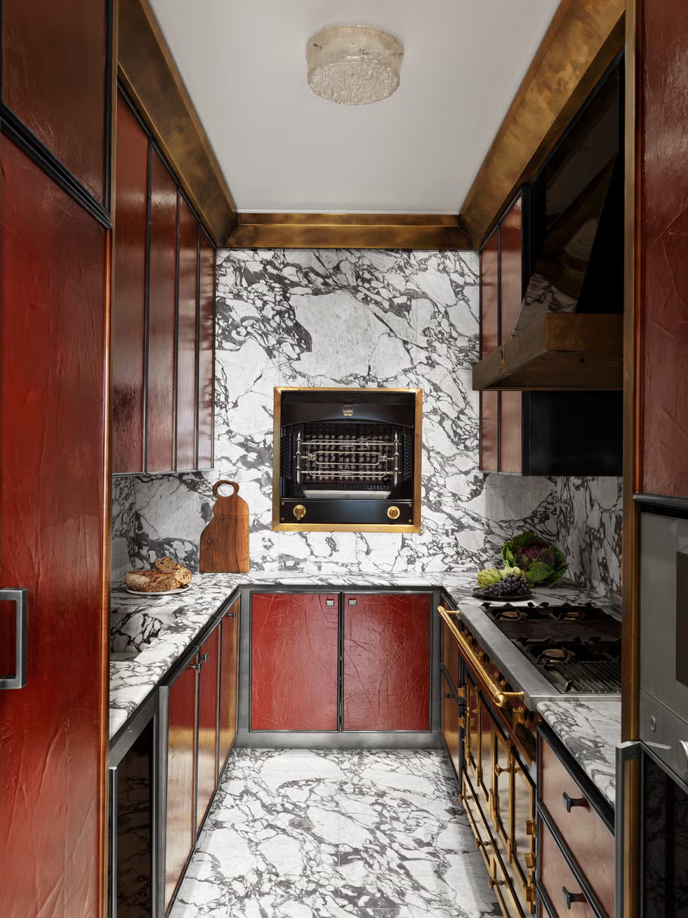
This Paris pad designed by Hugo Toro is literally gleaming with a custom shade of burnt sienna from Redfield & Dattner topped with lacquer and accented with handsome brass finishes.
A red kitchen doesn’t have to scream with the boldness of Paolo Castellarin and Didier Bonnin’s color-saturated, fire-engine red universe (though we love that they went there). Instead, a more muted, sophisticated tone can transform the space into something warm, inviting, and exude a sense of understated luxury. These deeper, subdued reds—like shades of crimson, burgundy, and oxblood—are on high demand in the paint world, according to Joa Studholme, Farrow & Ball’s color curator. “We are generally looking at earth tones in the kitchen, so clay shades or deep greens that connect us with the earth and reflect the peace and tranquility of nature while adding a flourish to our homes that has an old school feel," Studholme says. Studholme predicts that the U.K.-based paint company’s deep clay tone Etruscan Red will spotlight in many a kitchen next year, which Studholme says, “feels luxurious and atmospheric on a central island with warm neutral Stirabout on walls and Jitney on cabinets.”
Creamy Brown
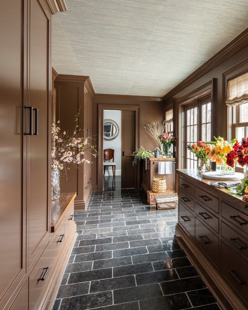
In this stylish Connecticut retreat, a butler’s pantry is doused in a stunning creamy brown.
Last year, we concluded that brown was poised to be the most popular color of 2024. In the following months, our prediction played out seemingly right on cue: “mocha” was the word on everyone’s lips at press previews, earth-toned monochromatic moments dominated the runways, and designers were flexing brown tones in everything from kitchens to bedrooms.
Even the paint companies got on board. Pantone dubbed Pantone 17-1230 Mocha Mousse its 2025 Color of the Year (COTY); Little Greene launched a warm palette ranging from honey to chocolate; and Stainmaster named a moody a rich chocolate-meets-taupe color called Truffle, luxury’s new It color. And now, in 2025, this color is reaching a fever pitch in interiors—especially kitchens.
This rich, earthy hue brings a sense of grounding and comfort to the cooking space, offering a modern twist on classic neutrals. Whether used on cabinets, walls, or accents, brown adds depth and richness to the kitchen. It also complements a range of color palettes, from bold accents like deep greens and blues to softer tones like beige and cream. Brown pairs beautifully with natural materials like wood, stone, and metal, creating a cozy yet sophisticated atmosphere.
Plum Purple
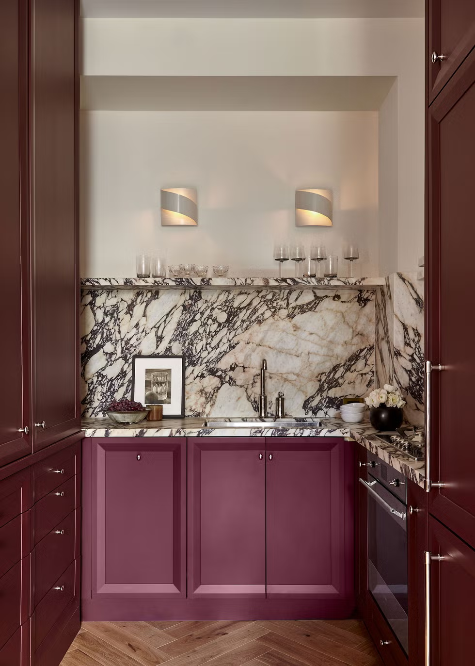
The kitchen in this Manhattan apartment was converted into a functional showpiece, with bold marble and cabinets lacquered in Farrow & Ball’s sultry Preference Red.
Purple is having a moment in the design world. As this year’s COTY announcements trickled in, it became clear that we’re poised for a bona fide purple fest: with Minwax’s Violet, GLIDDEN Paint by PPG’s Purple Basil, Benjamin Moore’s Cinnamon Slate (which is really just a muddied purple), and Behr’s ruby red Rumors (infused with can’t-be-missed purple undertones). It’s simply a matter of time before these trending colors find their way into the kitchen decor arena. With its rich, dusky hue, a muted plum purple adds depth and warmth to the kitchen, creating a space that feels both inviting and unique. Muted plum evokes a sense of luxury without being overpowering, creating an environment that’s subtly bold yet calming and adds a touch of drama without overwhelming the room’s ambience.
When incorporating this hue into your home, Emily Kantz, Sherwin-Williams’s color marketing manager says these muted tones lend themselves well to a color drenching opportunity. “I see these deeper colors being used primarily as the cabinet color and even as the corresponding wall color to give that immersive color experience that we have seen gain popularity over the past few years in color drenching,” she explains. “We have also seen these deeper shades paired with wallcoverings to add in a dose of pattern and personality.”
Deep Olive Green
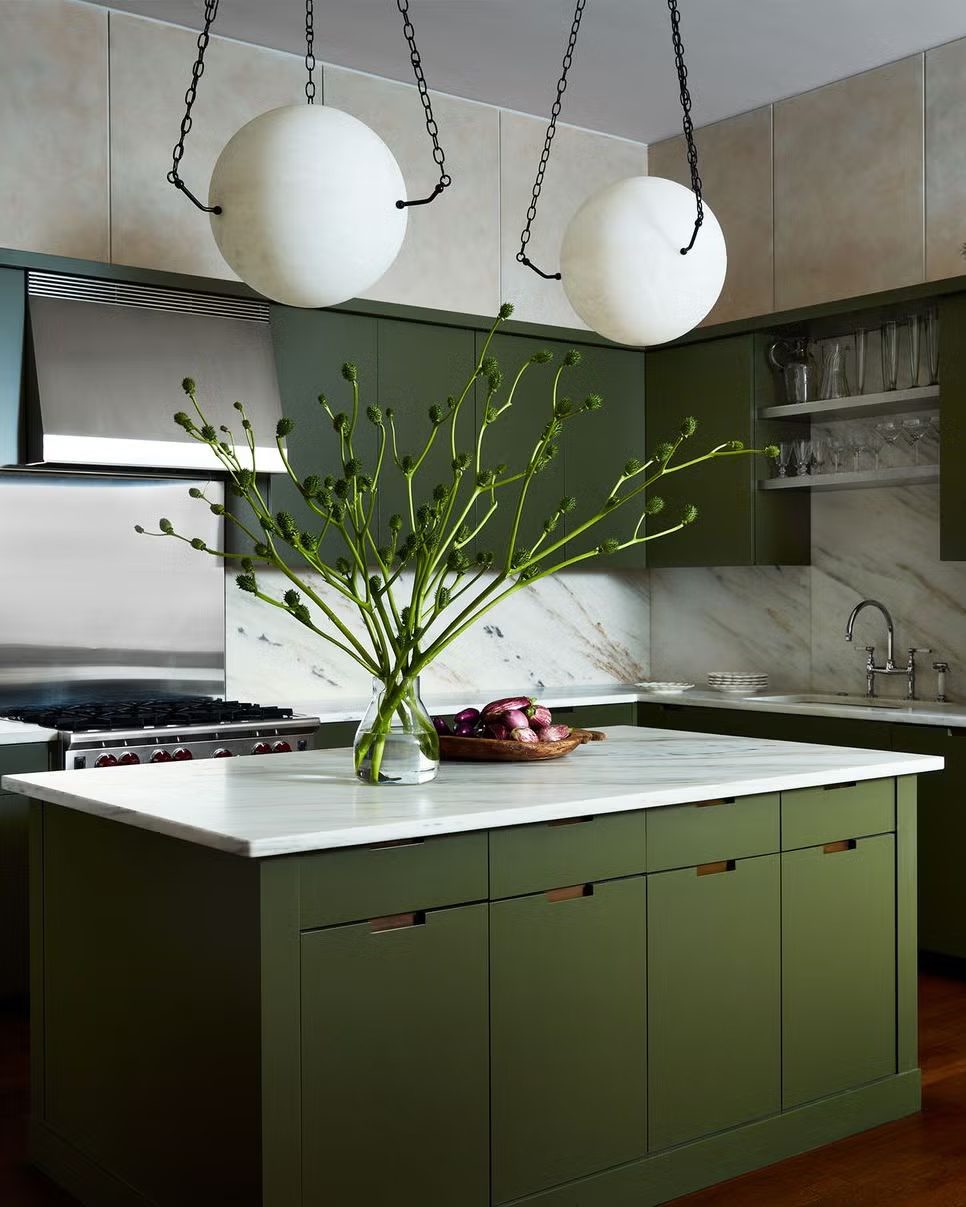
The very ’70s avocado green kitchen had its comeback for one hot minute—and now we're moving on. According to Farrow & Ball’s Studholme, that means turning the dial way down on the color wheel, with deep greens kitchens poised to be all the rage next year. “We are generally looking at earth tones in the kitchen, so deep greens that connect us with the earth and reflect the peace and tranquility of nature while adding a flourish to our homes which has an old school feel,” she explains, noting that Farrow & Ball’s classic Studio Green is a fan favorite for cabinets as of late. “It reads almost as black but with some extra subtle character, feels reassuring and sophisticated,” she adds.
As people seek environments that promote well-being and serenity, Yeo of Benjamin Moore says designers are increasingly drawn to this sophisticated hue. “Green hues have staying power with their flexibility, appearing rich, calming or refreshing,” she says. “These colors beautifully highlight the millwork on cabinets and trim, and instantly create a wonderfully moody kitchen, perfect for hosting.”
Muted Yellow
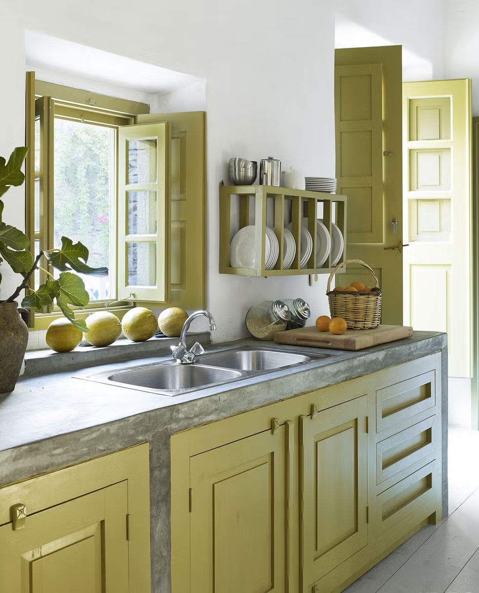
Greek architect Lilia Melissa gave this kitchen a paint treatment that she likens to seaweed.
In 2025, yellow is poised to be a big hit in kitchens. But it won’t be the yellow you think you know. A tonally ambiguous yellow could have undertones of greens, grays, and even blues. It might appear more like chartreuse or a desaturated gold. Harding’s favorite rendition of this hue is what she calls custard, a brownish yellow that she has observed appear in English gardens. “Nature is so clever, she creates a palette that works with our murky British skies,” the designer explains. “The light we have here is subtler and more gentle than other places, so we get these softer, muted tones as a result.”
When incorporating this into the kitchen space, Harding likes to paint joinery in this hue for contrast. “To keep that tonal approach and get away from it feeling blocky, I’ll break it up with different in-between shades to create soft, subtle contrasts,” she explains.
Earthy Tones
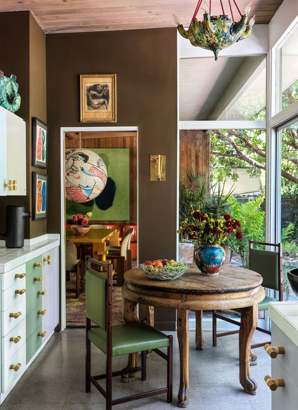
In the kitchen of his parents’ California midcentury residence, designer Garrett Hunter gave it a wash in Sherwin-Williams’s Van Dyke Brown.
Trends are cyclical, and deep earth tones, it seems, are continually ripe for a comeback—or are they simply timeless? “We’ve seen natural wood cabinetry and flooring take over kitchen design this past year, and people are gravitating towards authentic wood tones that bring that innate warmth into the space especially the kitchen which is the main hub of the home,” says Kantz. “People are moving toward colors and materials that bring comfort and that enhance natural materials such as marble, granite, and quartzite.”
We practically have an “amen” from ELLE DECOR A-list designer Christine Gachot. “Chocolate brown takes the cake,” she holds, adding that earthy browns are the firm’s It color of the year. “Call it Caramel, Cinnamon, or Camel—the warmth of a tawny brown defines our Gachot Palette DNA, bringing an earthy sophistication to any space. This deep hue is both timeless and refreshingly modern, providing a grounding presence that resonates throughout the room.”
An earthy wood-tone kitchen brings the outside in, blending simplicity and elegance in a way that feels modern, but with a deep-rooted connection to the natural world. When using it in the kitchen, Gachot recommends highlighting this hue with a soft blush to create a delicate balance between warmth and freshness or, for a bolder statement, pair it with deep jewel tones to enhance its luxurious quality. “This shade serves as a canvas for both subtle elegance and bold statements," she adds, "offering versatility that feels at once familiar and refreshingly new.”
About JINHAN FAIR
JINHAN FAIR for Home & Gifts(Poly Spring/Autumn Fair Phase Ⅱ) is a leading international trade platform organized by Poly Exhibition. Established in 2000, JINHAN FAIR has been successfully held for 53 editions and is recognized as one of China's most established sourcing fairs for the home and gifts industry. JINHAN FAIR is also the only Union of international Fairs-approved export trade fair in the home & gifts sector in China.
The 54th Jinhan Fair
Jinhan Fair Online Exhibition


 Visitor Registration
 Booth Application