


How to match colors in interior design?
2020.08.06
How to match colors in interior design?
In this regards, today I am sharing an interesting color research recently published by Italian design brand Poltrona Frau.
Colorsphere is a new way to match and represent color palettes which follows a perceptual-emotional pathway. It is a design tool, conceived for the world of architecture and interior design, as well for all those who strive to create a harmonious and lasting relationship between spaces and furnishings.
The new color system was conceived by color designer Giulio Ridolfo to reinvent the Pelle Frau® Color System collection and can be an inspiring tool for interior designers as well. The chromatic maps reflect the fluid, rapid and interconnected world we are living now.
“Design and furnishings are part of this process: furniture and objects – and their colors – are no longer made of just one material – static, autonomous – they must instead complement and connect with each other and with the space that hosts them in an increasingly narrow visual and spatial dialogue. The perception of color has become emotional and individual, influenced as it is by the continuous relationship with other elements, by the comparison with different cultures and latitudes, and by the combination” says the Giulio Ridolfo.
Let’s see them together.
Color Trends from Italy 2020 2021 for interiors and design

“All colors are the friends of their neighbours and the lovers of their opposites.” Marc Chagall
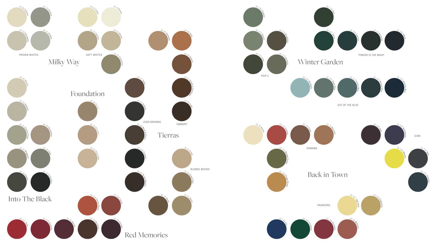
Into the Black / Palette #1
Color Trends from Italy 2020 2021 for interiors and design
Source
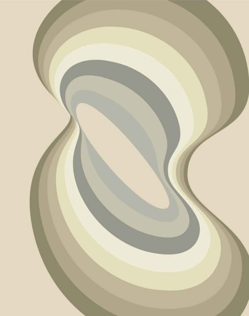
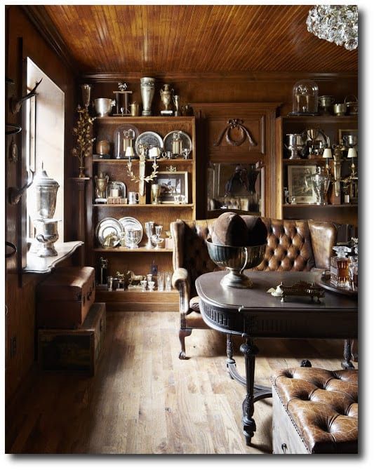
Into the Black is a journey towards deep black through a sophisticated scale of warm and cold greys, with perfectly balanced tones and inter-tones. These are the colors of the executive world, of stones, of functionalist and experimental architecture. Widely used in interiors and architecture, they allow ample freedom of combination with the most disparate materials and furnishings, without ever losing their extraordinary elegance.
Milky Way / Palette #2
Color Trends from Italy 2020 2021 for interiors and design
Source
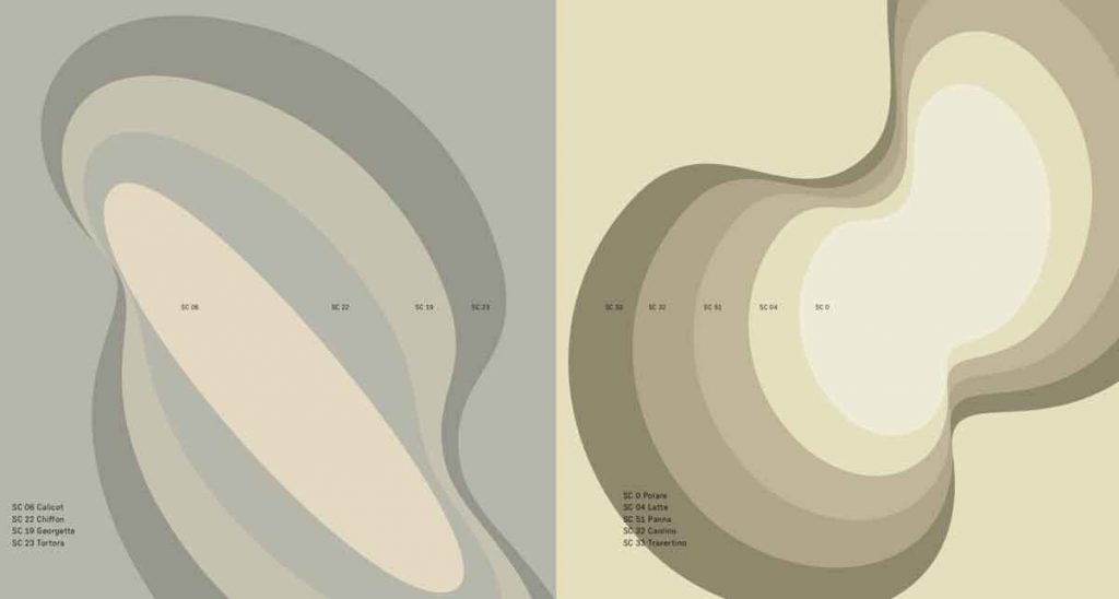
The galaxy of whites shines with numerous warm and cold shades. The icy, luminous elegance of the Frozen Whites group includes four shades of cold whites inspired by the most luxurious and refined fabrics. The group of Soft Whites includes five very sophisticated shades of warm, mellow whites which give leather a diverse array of visual and emotional characteristics, from cream to porous marble.
|| Be inspired:
Off whites decor trend
Champagne color trend in interiors
Frozen Whites / Soft White
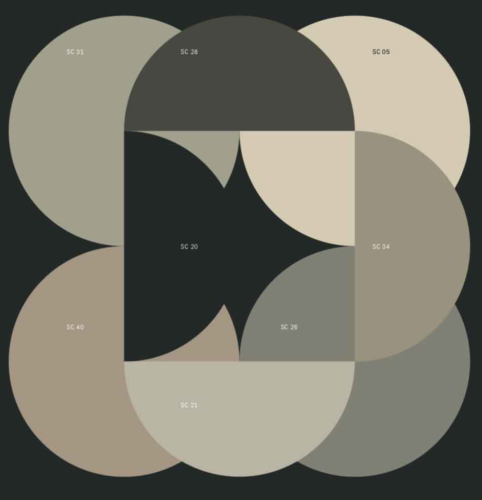
Foundation / Palette #3
Color Trends from Italy 2020 2021 for interiors and design
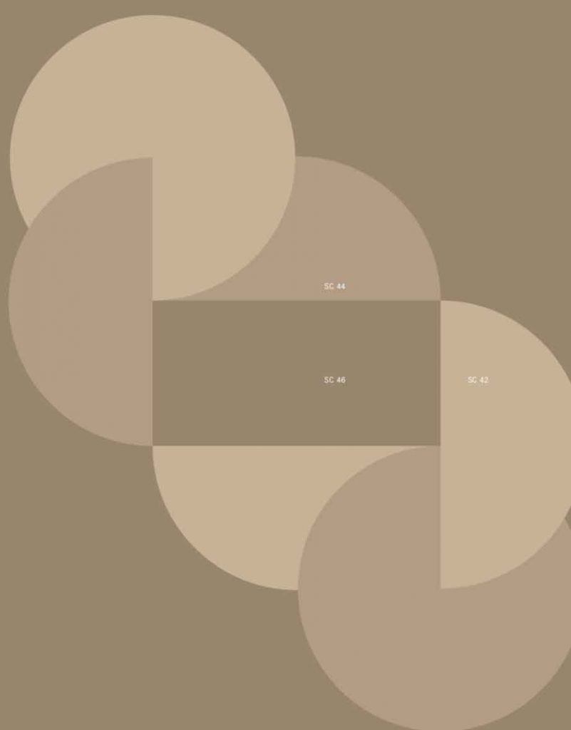
Like a thin veil of make-up that enhances the complexion, here is Foundation. The natural and subdued elegance of non-colors, of those shades that give a refined and particular tone to an entire environment without imposing a strong presence. Three light, refined and versatile shades that play between grey and beige, which recall the scent of face powder, hazelnuts or freshly baked biscuits.
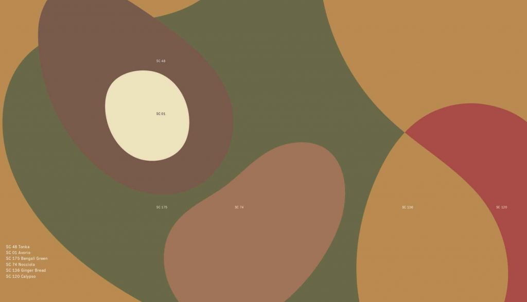
Tierras / Palette #4
Color Trends from Italy 2020 2021 for interiors and design
Source
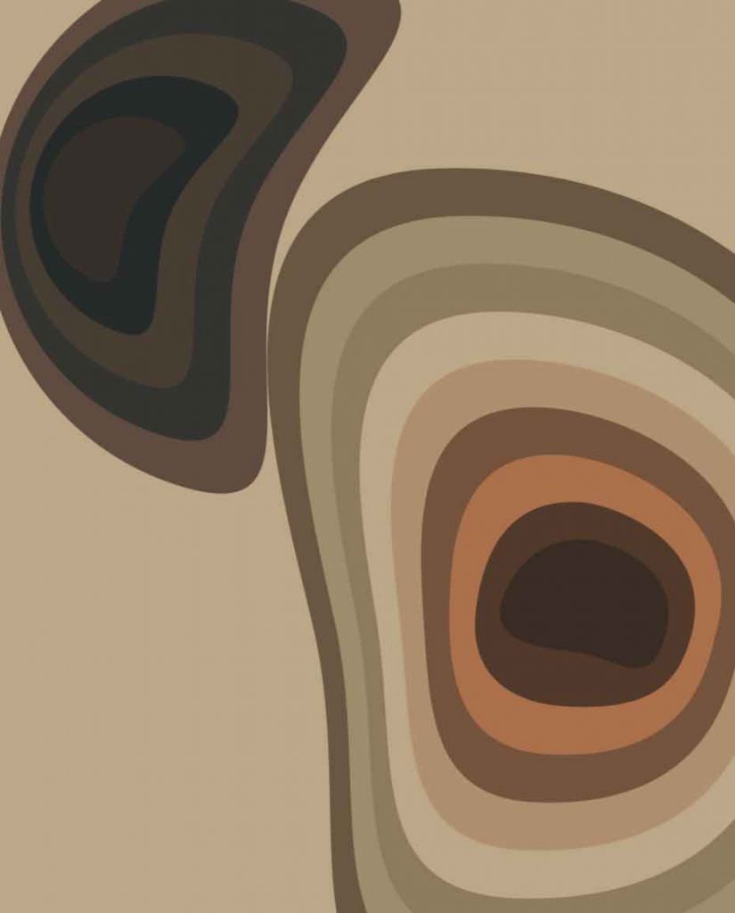
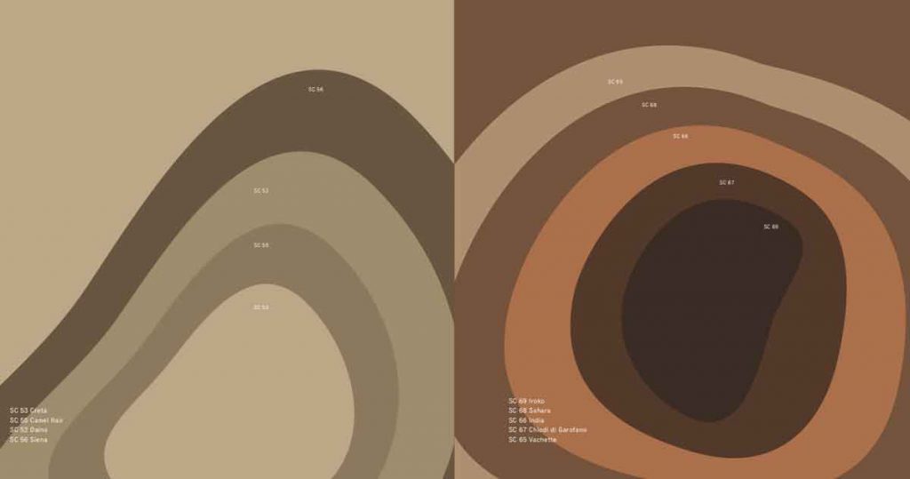
Tierras is a collection of dark and light browns, colors of nature, of leather and saddle-leather par excellence. Blonde Woods, Tannery and Ever Browns recount the timeless tones of the great English tradition of clubs, fumoirs and the equestrian world. A cultured and contemporary reinterpretation that comes to explore new ranges of blonde hues inspired by precious woods and the interiors of the most exclusive luxury cars.
|| Be inspired:
Caramel brown color trend in interiors and design
Caramel color and tan decor for a timeless chic interior design
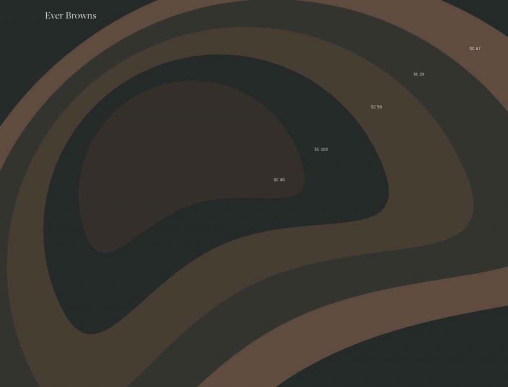
Blonde Woods / Tannery / Ever browns
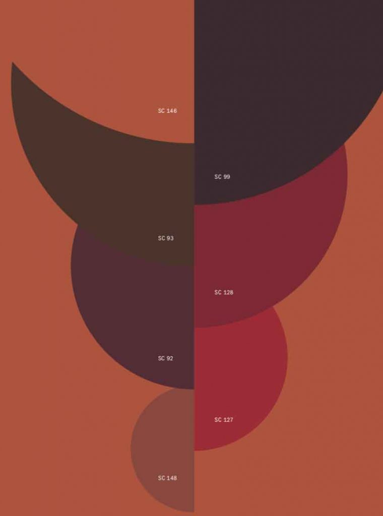
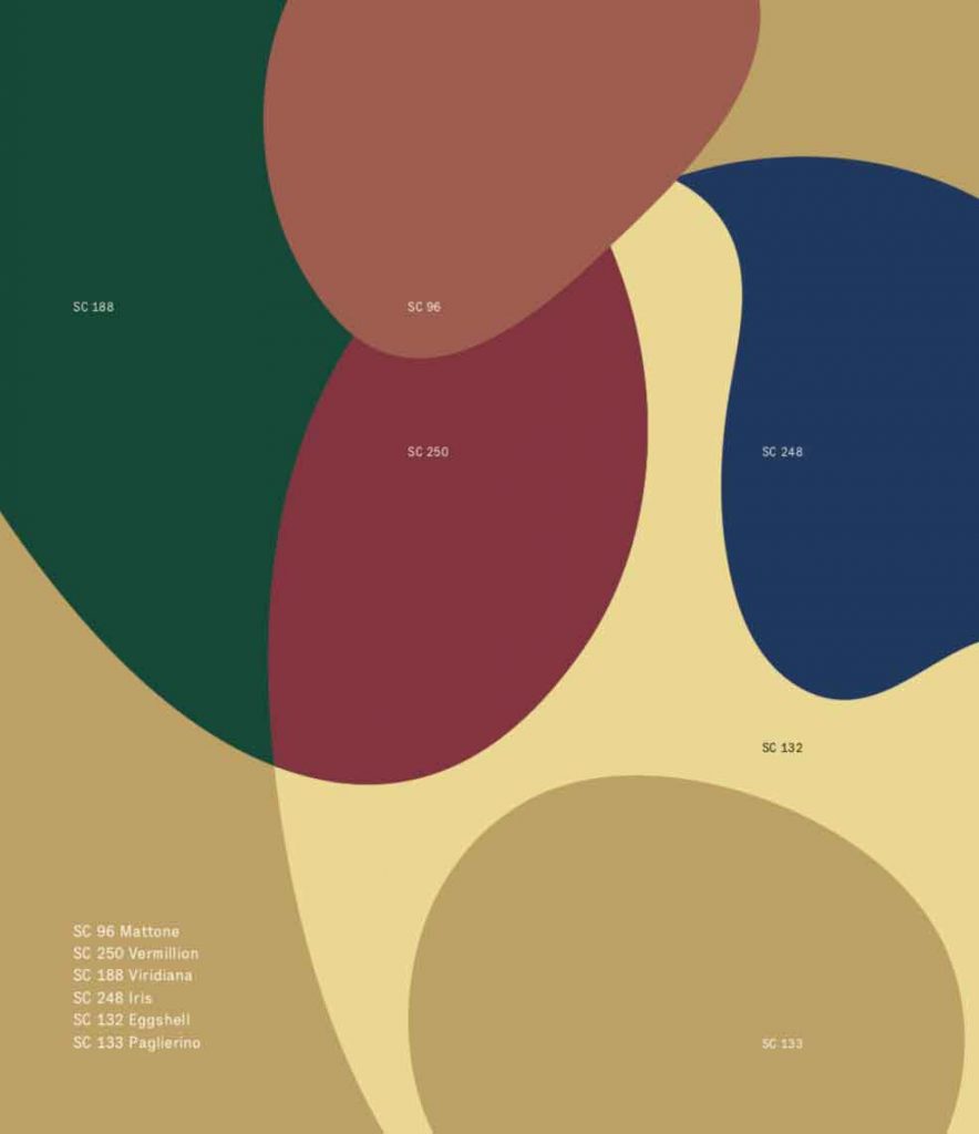
Red memories / Palette #4
Color Trends from Italy 2020 2021 for interiors and design
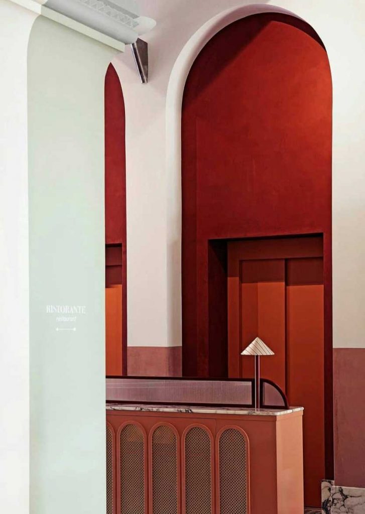
@ilpalazzoexperimental
If they were wines, they could be called “The great reds of Poltrona Frau”. Like their counterparts in the bottle, these sumptuous and brilliant reds improve over time, acquiring richer and more precious shades over the years. Red Memories tells part of the history of the company itself, such as the red of the Vanity Fair icon that approaches Pompeian tones, or the suggestive and deep hues that recall lacquers, the cocciopesto and soft covers of ancient hand-bound volumes.
|| Be inspired:
Red interiors in vermilion Chinese red color trend
Decorating with red furniture and design
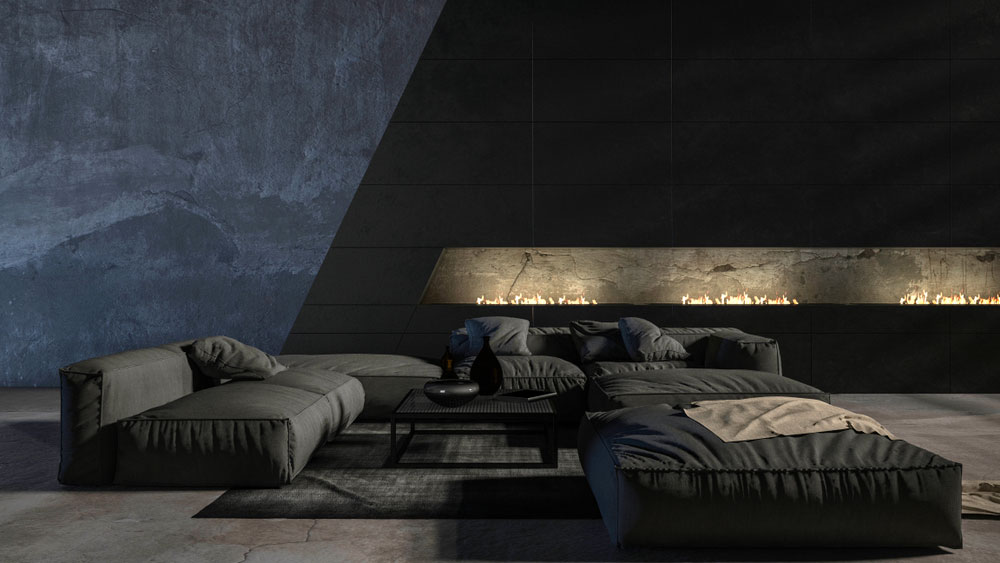
Winter Garden / Palette #5
Color Trends from Italy 2020 2021 for interiors and design
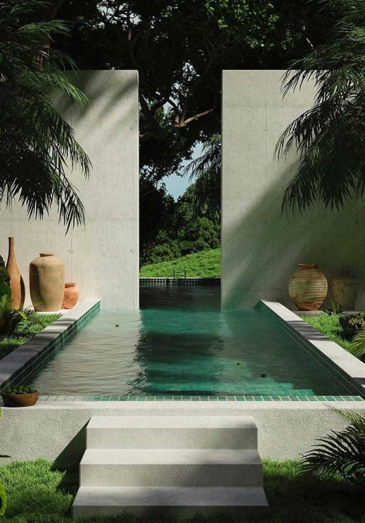
@charlottetaylr + @nrlyco
All the silent charm of a solitary jardin d’hiver seen at midnight: here is Winter Garden, which collects the magical and mysterious shades of greens and blues. Out of the Blue explores all the shades
of blue: from frozen tones to bright blues, up to the less saturated, lightest blues. The two renewed ranges of greens, Pier 1 and Tender is the Night, instead explore the intense and elegant nocturnal greens, up to the lighter, bluish, natural ones.
|| Be inspired:
Dark Green Color Trend
Dark Green furniture and home decor for a biophilic twist
Light Green color in interiors with Pistachio green Trend

Back in Town / Palette #6
Color Trends from Italy 2020 2021 for interiors and design
Eclectic, bold, cosmopolitan: Back in Town associates colors that are not arranged according to a descending scale, combining them in a cultured and emotional way full of references.
Gion is the famous geisha district of Kyoto, one of the most exclusive and renowned in Japan. Its lights, its nightlife, its refinement are summarised in the vibrant and refined shades of purples, combined with vivid yellows. We are suddenly shifted to Paris luxury with Faubourg and its reference to the colors of French high fashion and leather goods. Ipanema is a chic neighbourhood in Rio de Janeiro overlooking the famous beach; the color refers to exotic worlds and South American and Latin panoramas.
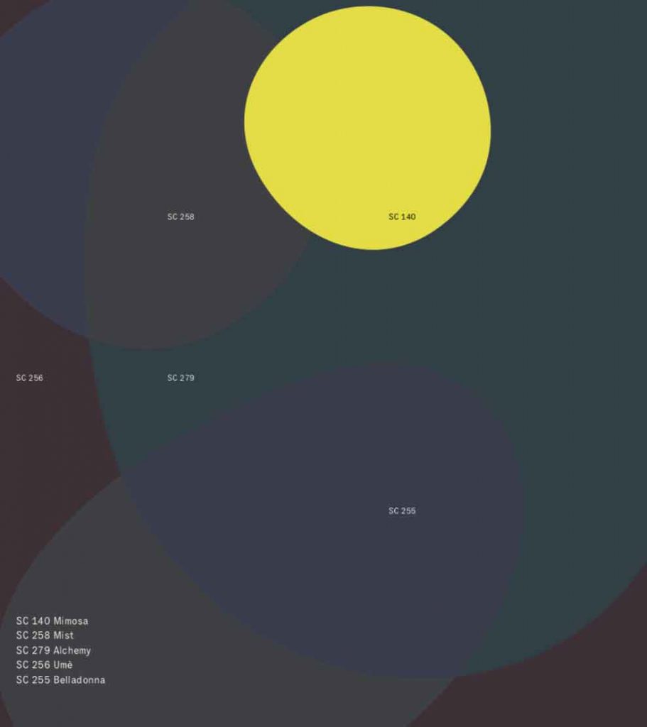
Gion
Faubourg
Ipanema
Jinhan Fair online exhibition will be held this October from 21 to 27.Should you have any query, we are glad to extend help at marketing@jinhanfair.com or you may reach us by a phone call to 0086-20-89308925.
To discover more about JINHAN FAIR, Please click to view the previous post-show reports.

About JINHAN FAIR
JINHAN FAIR for Home & Gifts(Poly Spring/Autumn Fair Phase Ⅱ) is a leading international trade platform organized by Poly Exhibition. Established in 2000, JINHAN FAIR has been successfully held for 53 editions and is recognized as one of China's most established sourcing fairs for the home and gifts industry. JINHAN FAIR is also the only Union of international Fairs-approved export trade fair in the home & gifts sector in China.
The 54th Jinhan Fair
Jinhan Fair Online Exhibition


 Visitor Registration
 Booth Application