


Pratt & Lambert 2018 Color trends
2018.01.05
BEYOND
The 2018 color forecast is all about searching farther and deeper than ever before — BEYOND what we know. Diverge to new worlds and realities, explore Boundless spirit and endless possibilities, Synthesize exotic combinations of organic and robotic; and finally, set a restful Intention for the mind and body.
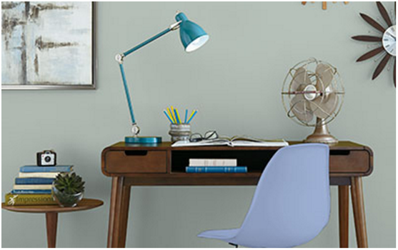
Get inspired by these color stories. Each was designed to be mixed and matched — with eight colors that are not only perfect paint colors but also can inspire furniture, accessories and other décor throughout your home.
We can’t wait to see how you bring them to life!
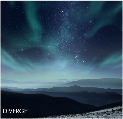
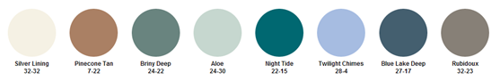
Embrace the future with this otherworldly palette.
Minimalistic colors and clean lines merge for a simple yet impactful design, and interiors are modest. Capture the imagination and a sense of exploration with celestial blues and rare-earth greens accented by dusty neutrals, like dune and smoke, that work together effortlessly to create a cohesive look.
From your dining room to your living room and beyond, these statement neutrals are a great way to evoke the mystery of places unknown.

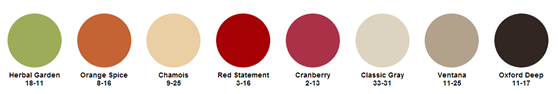
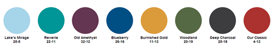
Transcend limits with bold, boundless color.
Driven by uncategorized and authentic storytelling, this palette is bold—merging neutrals with unexpected pops of color. Reinvent your space and celebrate your authenticity with energetic orange, herbal green and feisty reds that stand out against smooth creams and deep browns.
Whether you choose the bold or more subdued colors, this eclectic palette is the perfect way to let your personality shine in common spaces like your kitchen or living room.
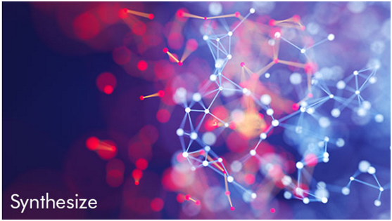
Technology colors the human condition.
Featuring vivid colors used to re-energize natural patterns, this palette allows colors to blend, blur and bleed into one another. Stimulate the senses with brilliant pops of color: red juxtaposed against gunmetal and steel blue; violet against teal; the stark contrast of lush green and rich gold.
These colors speak volumes. Try them in your dining room or bedroom to bring a daring sense of drama — or even incorporate them in unexpected places, like your front and interior doors, to make a bold statement.

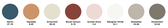
Achieve mindfulness with this fresh palette perspective.
This palette inspires us to live with a mindset that is thoughtful and restful. Less is more with interiors that are calm, decluttered and tranquil. Create a weightless interior through light whites, calming neutrals and soft grays. Navy and tan are grounding colors that contribute to the sense of stillness — giving any space the feeling of restfulness.
These colors are the perfect way to create a retreat in your own home, bringing calmness to a living room, serenity to a bedroom and mindfulness to a reading nook.
The 49th Jinhan Fair
Jinhan Fair Online Exhibition


 Visitor Registration
 Booth Application