Pantone doubles up for Color of the Year selection
2015.12.11
CARLSTADT, N.J. — For the first time in 16 years of choosing its Color of the Year, international color authority Pantone revealed a pair of selections today.

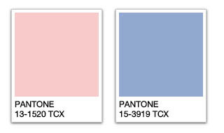
Rose Quartz, left, and Serenity were selected by Pantone to share the title of 2016 Color of the Year.
Rose Quartz (Pantone 13-1520), a pale shade of pink, and Serenity (Pantone 15-3919), a baby blue hue, were chosen to share the title of 2016 Color of the Year. Pantone called the combination "a harmonious pairing of inviting shades that embody a mindset of tranquility and inner peace."
“With the whole greater than its individual parts, joined together Serenity and Rose Quartz demonstrate an inherent balance between a warmer embracing rose tone and the cooler tranquil blue, reflecting connection and wellness as well as a soothing sense of order and peace,” said Leatrice Eiseman, executive director of the Pantone Color Institute.
Eiseman said the twin selections reflect a melding of masculine and feminine perspectives in fashion that “challenges perceptions of color association.”
“In many parts of the world we are experiencing a gender blur as it relates to fashion, which has in turn impacted color trends throughout all other areas of design,” she said. “This more unilateral approach to color is coinciding with societal movements toward gender equality and fluidity, the consumers’ increased comfort with using color as a form of expression which includes a generation that has less concern about being typecast or judged, and an open exchange of digital information that has opened our eyes to different approaches to color usage.”
Pantone forecasts the combination of Rose Quartz and Serenity to bring a sense of calm and relaxation to interior settings. It says the two shades are ideal for rugs and upholstery, and should also be prevalent in paint and decorative accessories. It said coupling solid and patterned fabrics, throws, pillows and bedding in these shades provides a comforting respite and feeling of well-being in the home and that incorporating texture enhances the duality and kinship of these hues.
“Like a serene sunset, Rose Quartz encourages reflection on one’s surroundings while Serenity, a transcendent blue, provides a naturally connected sense of space,” Pantone said in a press release.
At the first major trade show of the year, the Jan. 12-19 Atlanta International Gift & Home Furnishings Market, AmericasMart will celebrate the two shades as part of a Pantone Design Exhibition. A number of influential interior designers will design vignettes from product sourced from vendors at the market in Rose Quartz and Serenity. Additionally, Laurie Pressman, vice president of the Pantone Color Institute, will host a trend presentation during the market.
To arrive at the selection each year, color experts at the Pantone Color Institute comb the world looking for new color influences. This can include the entertainment industry and films in production, traveling art collections and new artists, fashion, all areas of design, popular travel destinations, as well as new lifestyles, playstyles and socio-economic conditions. Influences may also stem from new technologies, materials, textures and effects that impact color, relevant social media platforms and even upcoming sporting events that capture worldwide attention.
Pantone has selected a Color of the Year since its choice of Cerulean in 2000. In 2015, it selected Marsala as its influential shade.
Source: Furniture Today


 Visitor Registration
 Booth Application