


How to Use Marsala, Pantone’s 2015 Color of the Year
2014.12.08
Though the Color of the Year selections from paint companies are geared specifically for use in home decor, Pantone’s choice is meant for broader application, such as in the field of graphic design and the fashion industry. Indeed, Marsala, Pantone’s pick for 2015, does remind me of a pair of Toughskins pants I sported as a kid growing up in the 1970s. But in all seriousness, this earthy rum-raisin hue also could work well in the home. I just think it needs to be partnered with colors that have a bit more life to them to keep the palette from feeling dull.
One in a series: Keep an eye out for more coverage of companies’ featured colors for 2015.
Jennifer Ott Design
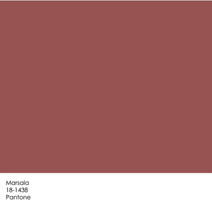
Marsala is a reddish-brown hue, a cherry-chocolate that, according to Pantone’s LeatriceEiseman, “has an organic and a sophisticated air.” And while black has perhaps become overused and expected, Marsala has “a vintage but neutral feel, which evokes pleasant memories,” she says.
It did not evoke pleasant comments when I posted it on social media sites soon after its release. Many found it too boring or dated. One friend simply said, “Yuck.” My favorite comment was from someone who said it reminded her of the mauvey-brown lipstick her grandmother wore in the early nineties.
But one friend did ask me how one could use this color in the home, so let’s take a look.
Ed Ritger Photography
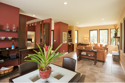
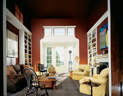
Red hues are thought to stimulate the senses and our appetites, so it’s a good choice for a dining area. In this space the ruddy hue is paired with a happy yellow in the adjacent room. The white ceiling and wall of windows join forces with the yellow walls to keep the space light, happy and bright.
FORMA Design
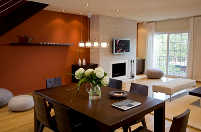
Here’s a similar red-brown, with more rust in it, that I think works well as an accent wall color in this space. Because this color is so deep and dark, and a bit muddy, it needs lots of white and natural light to keep it upbeat. I think it looks rich and sophisticated here.
Currant Interior Design
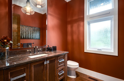
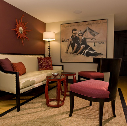
I’m a fan of bold-colored bathrooms and powder rooms, along with other rooms that we pass through only occasionally or don’t spend huge amounts of time in. You can pull off a more unusual or intense color in those spaces, since you hopefully won’t find yourself spending hour upon hour there.
Harrell Remodeling
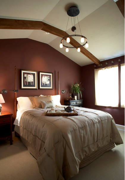
This hue is darker than Marsala and has a bit more red in it, but is a similar red-brown hybrid. A bright red bedroom might be too high energy for a room you plan to rest and sleep in, but by going with a deep red that has plenty of dark brown in it, you’ll get a more relaxed, mellower vibe.
Rachel Reider Interiors
Marsala shades work well in traditional or transitional spaces when paired with other warm hues, such as reds, yellows, oranges and true browns. This space would feel warm and cozy on a cold winter evening.
Ike Kligerman Barkley
Or go for more contrast by combining Marsala with white painted trim and woodwork. The combination gives the room here a crisp and clean look, and the beautiful wood details really stand out.
Erdreich Architecture, P.C.
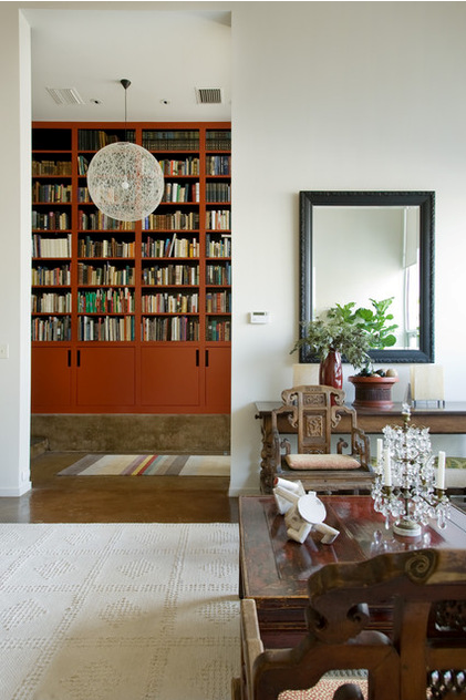
Or use it in small amounts, for niches, nooks and built-in cabinetry. The less you use of it, the more versatile the color will be. By that I mean you can more easily work in other hues you love without going overboard on color. And small amounts of color are much easier to change in the future should you desire a different look.
Source: Houzz
The 53rd Jinhan Fair
Jinhan Fair Online Exhibition


 Visitor Registration
 Booth Application