


COLOR OF THE MONTH | A DARKER SHADE OF GREEN
2019.12.11
Green has most definitely flourished as one of the key color trends in the last few years.
Stemming from the pantone colour of the year back in 2017 'greenery.' The particular shade – a zesty-green said to be 'symbolic of new beginnings' – to revive, restore and renew – a colour to convey nature's greens. However, as the name suggests 'greenery' didn't just have to confine us to one specific shade but more open our minds to green in a broader context. Ultimately looking at greenery – not only as a colour but an ideal – reconnecting with nature and lushness of the great outdoors.
“Greenery symbolises the reconnection we seek with nature, one another and a larger purpose.” Leatrice Eliseman, executive director Pantone. Green is indicative of hope – the anticipation of things to come – coin the expression “greener pastures” and "grass is greener" used in reference to something newer or better. 'Greenery' also reflected the emergence of biophilia in office design – effectively boosting employment activity, well-being and increased productivity when work spaces were infused with natural elements such as greenery and sunlight.
Pantone colour of the year is closely watched and directly influences product development in multiple industries – from fashion to interior design and branding – no surprise that there would be a surge in green. Our love for green has grown (if not rocketed) and we have seen it in various hues and shades, from verdant greens to fresh faced neo-mint (Previously written about in the future is green).
The colour neo-mint predicted as a new key colour for 2020 by WGSN – a 'new green' for a new decade, described as “an oxygenating, fresh tone that aligns science and technology with nature.” New greens – from muted mints, soft sage, pistachio to earthier olive green.
Dulux have also just recently revealed their new colour of 2020 as Tranquil Dawn 'a new dawn, a fresh start to a new decade.' Tranquil Dawn is said to 'sit somewhere between green, blue and grey- just like the fleeting beauty of the morning sky.'
Behr are also backing green with their colour of the year 2020 ‘Back to Nature’ encouraging us to embrace the spirit of discovery. Mentioning ‘as we enter the next decade, we strive for vibrancy and shape it how we choose. As nature's favourite colour, ‘Back to Nature'is described as a restorative and revitalising green hue that engages the senses and pairs well with other colours both inside and outside your home.’
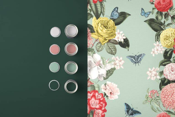
Whereas Graham & Brown announced ‘Adeline’ as their new colour of the year – opting for a considerably deeper rich bottle green ‘whose natural qualities work perfectly with most other colours.’ Designed to complement their ‘Bloomsbury’ wallpaper of the year.
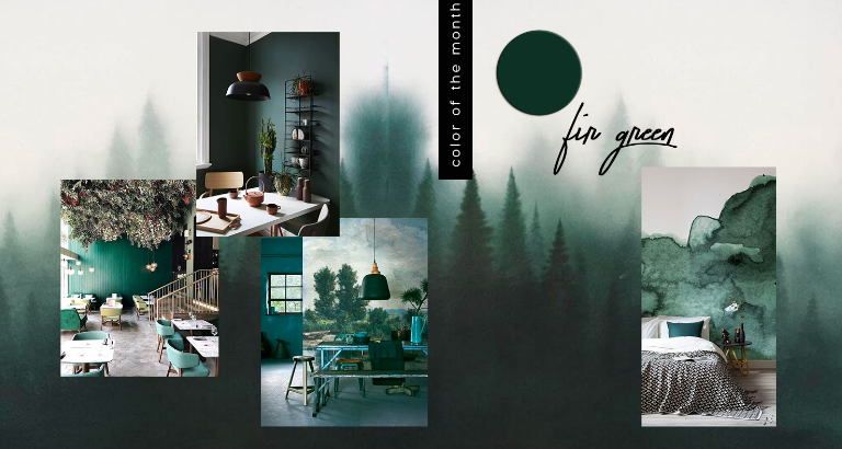
This time we venture deeper into green – the dark aromatic depths of dense forest and forage for fabulous fir greens.
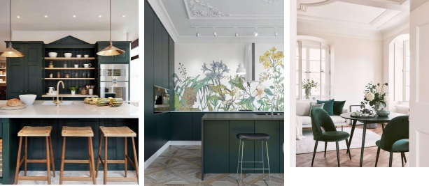
Dark green 'Adeline' Graham & Brown's Colour of 2020, wallpaper 'Bloomsbury' in Neo Mint
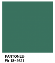
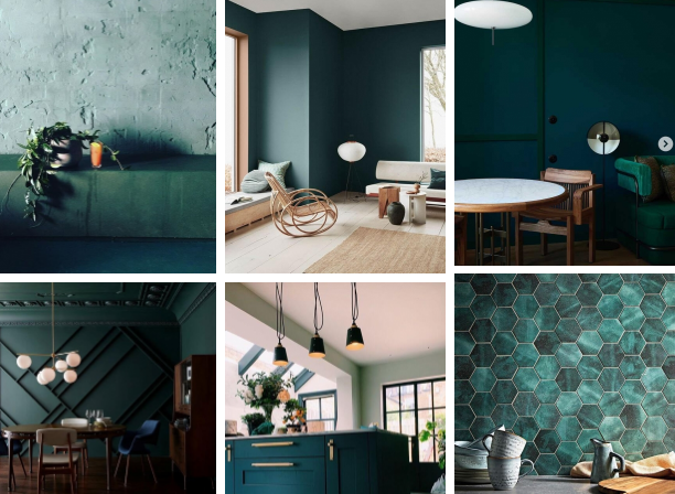
Via / Green colour swatches from Pantone including Fir, Forest Biome, Pineneedle
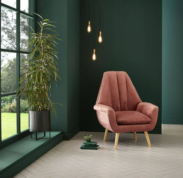
DARK GREEN COLOUR & DESIGN TREND 2020
Green is the colour of nature and ‘symbolises growth, harmony, freshness, and fertility.’
When it comes to forest green; the name itself sets the scenery, a dark green – commonly found in nature – it evokes visions of dense woods, thick bushes and tall trees. Green has two paradoxical meanings – on one hand suggesting nature and the environment however also commonly associated with money, wealth, prestige and greed. We refer to someone with a touch of the “green-eyed monster” as a jealous person and you may have heard the phrase “green with envy” standing for the feeling of jealousy and envy.
But if you bring it back to balance and harmony – green is thought to be the greater balancer of our mental, emotional and physical energies – hence, why there is so much green on our planet. Green is rejuvenating as a colour it revitalises when physically, mentally or emotionally exhausted. From a colour psychology perspective ‘it is the great balancer of the heart and the emotions, creating equilibrium between the head and the heart.’ As a colour green renews and restores depleted energy. It provides the sanctuary away from the strain and stresses of modern living, helping us to restore back to a sense of well-being. This is why there is so much of this relaxing colour on the earth, and why we strive for it to stay that way.
Green is an emotionally positive colour, that gives us the ability to love and nurture ourselves and others unconditionally. As a colour it taps into our nurturing nature – because of its link with the heart. Green encourages us to nurture others but it is also nurturing to us.
Bringing it back to nature… have you heard of the new ‘buzzword’ biophilic? Simply put, biophilia means the love of nature. Focusing on human’s innate attraction to nature and natural processes. Biophilic design is a way of innovatively designing and incorporating the natural world into the places we live and spaces we work and learn. We begin to further blur the boundaries between inside and outside – incorporating raw and natural materials wood, stone etc. or adding some living plants to your home or workspace. Note how there has been a huge rise in bringing plants indoors. We have seen indoor plant sales boom in recent years, not only does this tie in with this design trend but also a reflection of urbanisation. As a nation we are increasing living in tight spaces in ever increasing tight cities where access to nature is reduced.
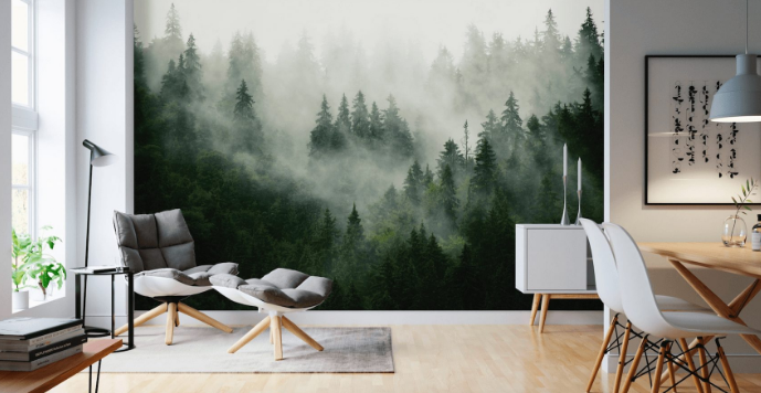
DARK GREEN COLOR TREND 2020
IN INTERIORS & DESIGN
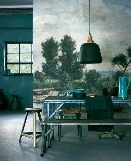
A perfect colour for lovers of dark interiors but with green being classed as a ‘new neutral’ it also falls into the neutral/natural feel too. There are many ways to incorporate dark green – the power of paint, simply painting a wall deep green, products and soft furnishings to even bringing plants inside. Combining blue and green together in a palette represents nature, water and the new growth of the forest. Whereas green and brown/ beige together is associated with organic or recycled materials. Pair green with pink or deepened to red and inevitably we think Christmas.
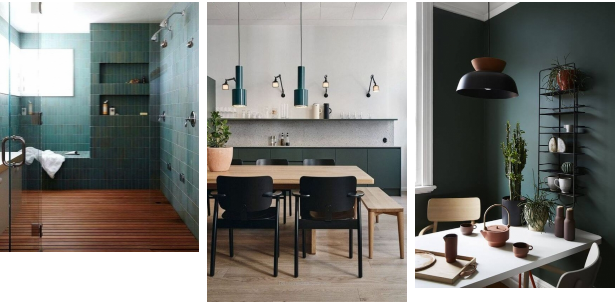
@fornasettiofficial @harrods / via @amy_moorea, @domustiles
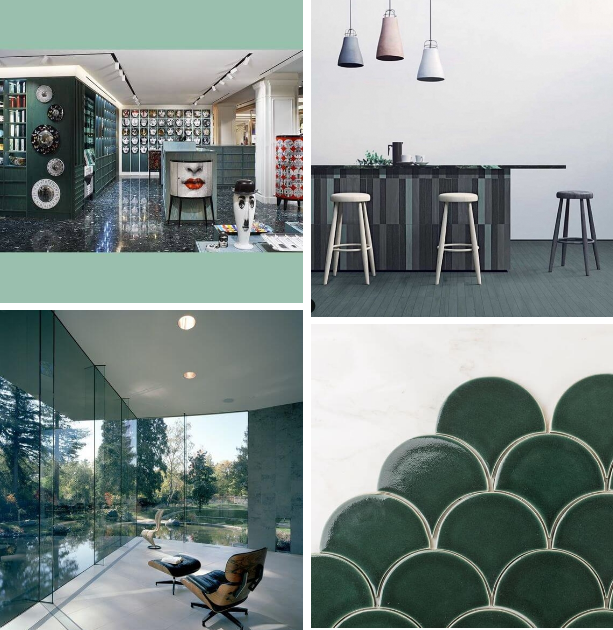
Via Lakeside Studio by Mark Dziewulski Architect / Fireclay tiles
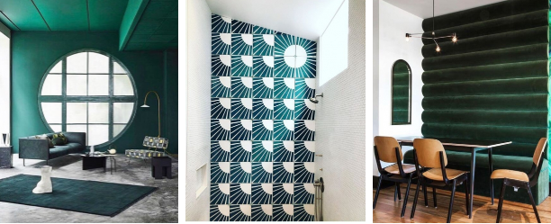
@caseyfreemanart / via
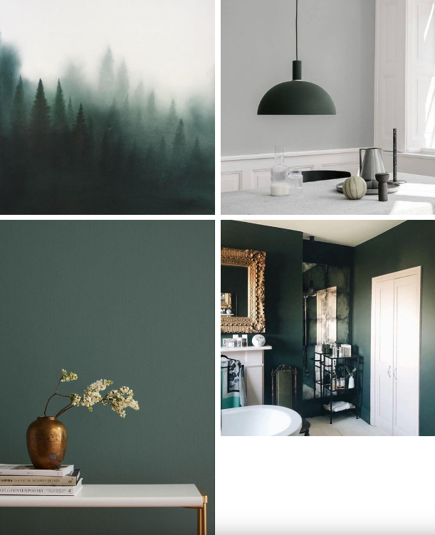
Via / via @mad_about_the_house
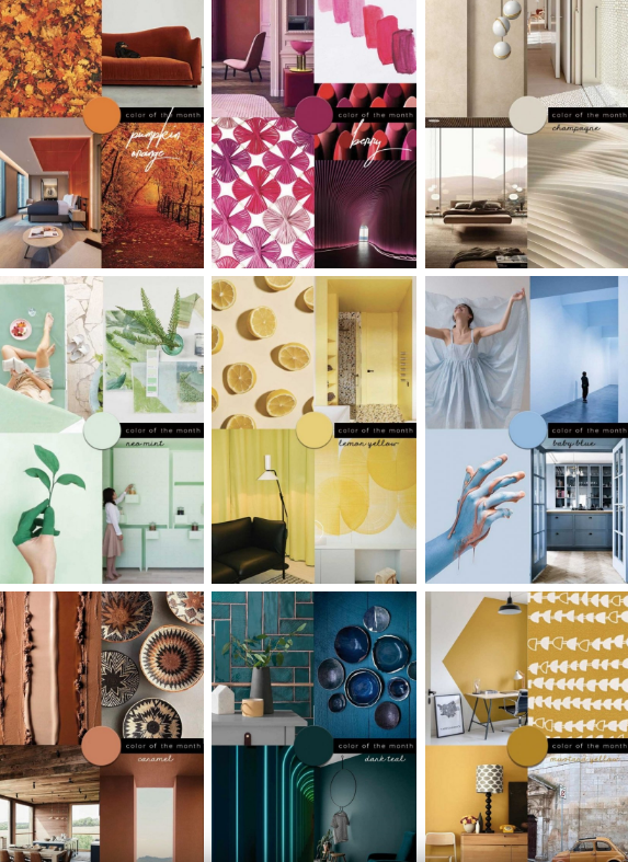
Be inspired by the latest color trends:
The 53rd Jinhan Fair
Jinhan Fair Online Exhibition


 Visitor Registration
 Booth Application