


9 New Ways With Red, White and Blue
2015.07.02
With subtle adjustments to hue, tint, tone or shade, this patriotic color combo works for more than just the U.S. Flag
Sure, red, white and blue are striking on Old Glory, but it’s not a common color scheme for homes. That isn’t to say it can’t work. The trick to making it look fresh and modern is to play around with the red and blue. With just a slight adjustment in hue, tint, tone or shade you can create a look that is dramatic and elegant, fun and playful, or soft and pretty. In honor of the upcoming Fourth of July holiday, I’ve gathered nine examples of red, white and blue spaces that take this flag-inspired palette in an interesting direction.
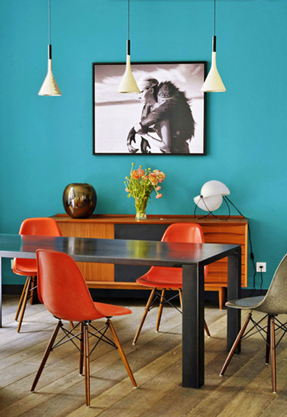
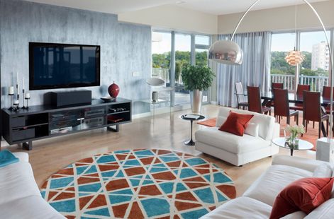
Here’s a decidedly modern take on the trio. Cool colors tend to visually recede, so this bold tropical-blue wall makes the space feel more expansive. It also serves as a nice backdrop for the contrasting red-orange dining chairs. A bold and vibrant color palette such as this in a dining room will surely spur some equally vibrant dinner conversation.
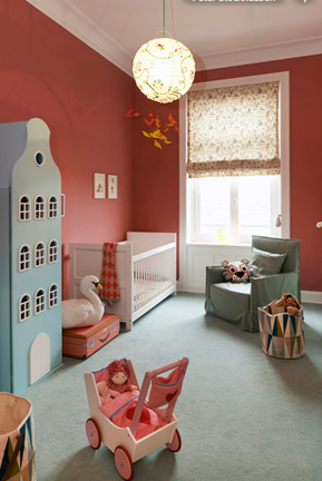
Red and blue, being primary colors, have long been popular choices for children’s spaces. But if you go for large amounts of primary red, think about pairing it with a softer blue. The light blue elements in this room keep the palette from feeling heavy or somber.
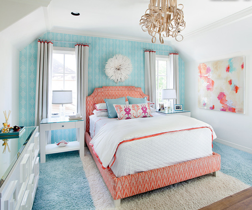
Here’s an example of a softer, gentler red, white and blue palette. The orangish-red of the bed upholstery is softer than the reds shown in the previous examples. The small bit of it, along with the watery blues, comes together nicely with the large expanses of white to give this bedroom a soothing and airy feel.
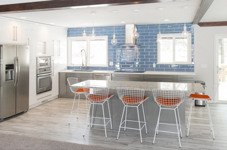
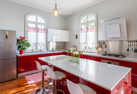
Add some drama and visual punch to a mostly white kitchen with a few dashes of bold orange-red and a medium blue. This backsplash tile color reminds me of slightly faded blue jeans, creating a relaxed and comfortable vibe. There’s a nice injection of color in this kitchen — enough to allow one’s eye to move around the space, taking in all the nice finishes, but not so much that it is garish or overwhelming.
The whisper-soft blue-gray walls in this kitchen softly contrast the pure white ceiling. I don’t think the effect would be as interesting if the walls were the same hue as the ceiling. Both colors recede into the background to let the bold cranberry-red cabinets take center stage. This is a great way to incorporate a red, white and blue palette in which the colors don’t fight one another, but rather unite to create a visually appealing space.
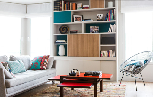
For those with color-commitment issues, think about using our featured hues for decorative accessories only, such as accent pillows and rugs. These items don’t have to cost a lot of money and, unlike tile and cabinetry, they are a breeze to replace.
Add fun dashes of color to a mostly white and wood-toned space with a bold teal blue and an eye-popping red. Just use the bolder colors sparingly, and sprinkle them around the room in a few different places for harmony and balance.
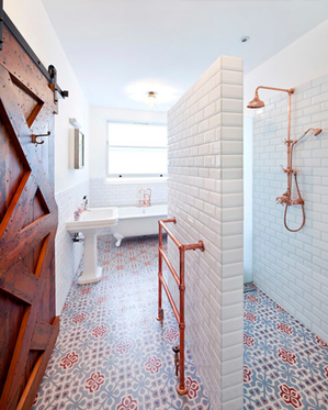
Here’s another mostly white space that features relatively small bits of red and blue via the cool floor tiles. You want beautiful and statement-making tile such as this to be the star of the room, so keep everything else toned down and neutral.
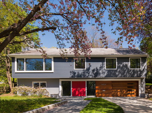
Take our featured palette outside by going with a neutral grayish-blue for the siding and, for the front door, a very vibrant and welcoming red. White painted trim can always be counted on to provide a crisp and clean look.
Source: Houzz
About JINHAN FAIR
JINHAN FAIR for Home & Gifts(Poly Spring/Autumn Fair Phase Ⅱ) is a leading international trade platform organized by Poly Exhibition. Established in 2000, JINHAN FAIR has been successfully held for 53 editions and is recognized as one of China's most established sourcing fairs for the home and gifts industry. JINHAN FAIR is also the only Union of international Fairs-approved export trade fair in the home & gifts sector in China.

The 54th Jinhan Fair
Jinhan Fair Online Exhibition


 Visitor Registration
 Booth Application