


How to Add Color if You’re Color Shy
2015.02.11
When talking about adding color to a home, many people tense up. That’s because what immediately comes to mind when you say “color” is bright, bold, eye-popping hues. If that’s not your thing, then of course you’re going to get heart palpitations imagining your home swathed in searing orange and electric green.
But adding color is about so much more than shock. By working with a palette you’re comfortable with, no matter how neutral, muted or beige it is, you can add a variety of colors and still feel at ease. Here are some of my favorite ways to toss some new hues into your home without feeling thrown for a loop.
Angela Ruple Interior Design
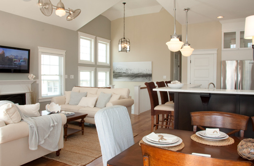
Mixed neutrals. One of the first ways to add a sense of color to a space is simply by mixing a variety of neutrals. In fact, for many this is the first and last step in creating a rich look without any wild hues. Look for places to include gray, beige, white, black and wood tones, letting the contrasts of the subtle undertones bring each color to life.
Hugh Jefferson Randolph Architects
Metallics. Metallics, especially gold and other warm options (like brass and bronze), are important in expanding any color scheme without its feeling overloaded. The undertones and lustrous finishes will add depth to your palette without reading as color.
Meredith Heron Design
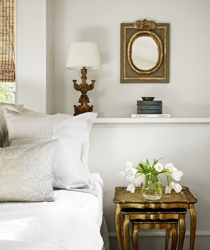
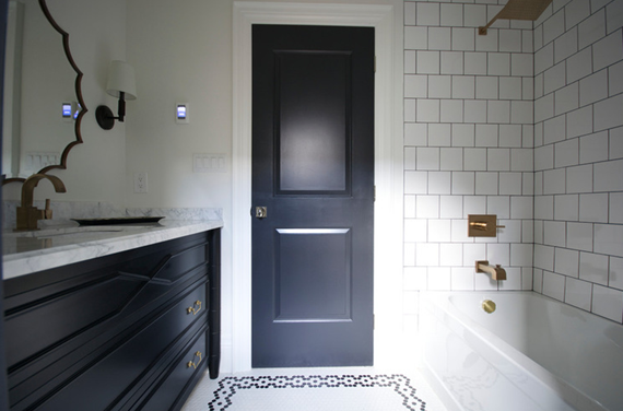
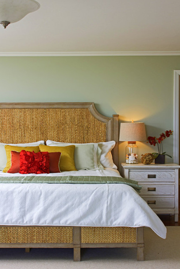
Navy. Blue, as far as true hues go, is possibly the most neutral, as it is the color we see in the sky every day and thus almost expect to see in our indoor spaces. Noble navy is especially neutral and will never go out of fashion, making it a perfect starting place to expand a color palette.
Tip: An inky navy paint treatment on a door or built-in unit adds color that feels seamlessly integrated into the architecture.
Christopher Stark Photography
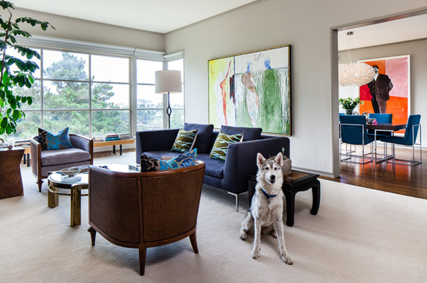
The timelessness of navy also makes it an excellent choice for colored upholstery, as it will coordinate with new schemes down the road, making accessories pop without demanding attention.
A. Rejeanne Interiors
Pale green. Muted greens are another trendy (yet classic) near-neutral. Green is such a strong color in nature that we’re accustomed to seeing it paired with virtually every other hue, making it an excellent way to add life without creating strong contrast. Look to Benjamin Moore’s Color of the Year, Guilford Green, as a great example.
Mint. For an even fresher and more modern near-neutral, try a pale mint shade (between blue and green) that reads almost as gray. It makes wood tones sing and helps white trim look especially crisp.
Faiella Design
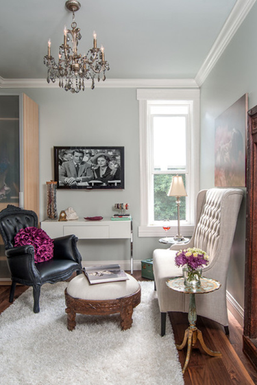
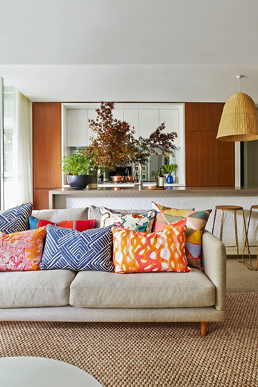
Choose a family. If you want to add a few more hues but don’t want the palette to feel overwhelming, keep in mind that colors in a single saturation family will appear more harmonious. In other words, choosing all pastels or all jewel tones — colors that all have the same degree of richness — will keep the palette looking logical and not overstimulating.
Croma Design Inc
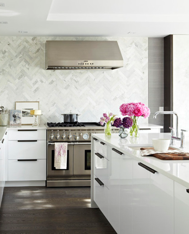
Flowers. In spaces without many soft furnishings, flowers are an excellent way to add an ever-changing burst of color. Notice how the only truly colorful items here are the bright blossoms and a lone tea towel, and yet the space still feels like it carries a pink and purple color scheme.
Tip: Keeping your kitchen in blooms doesn’t have to be expensive. A cluster of carnations in a simple glass vase can keep your counter rosy for a few dollars a week.
Jessica Helgerson Interior Design
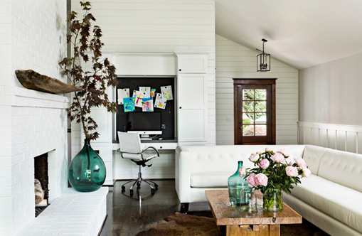
Glass. Tinted glass is the best of both worlds: It has the potential to bring in vivid, striking color but automatically blends into any space. Because it is transparent, its color naturally blends into the background, so you can use a few pieces sprinkled throughout a space for a hint of ethereal beauty or cluster many together, so they blend into a veritable rainbow.
Arent & Pyke
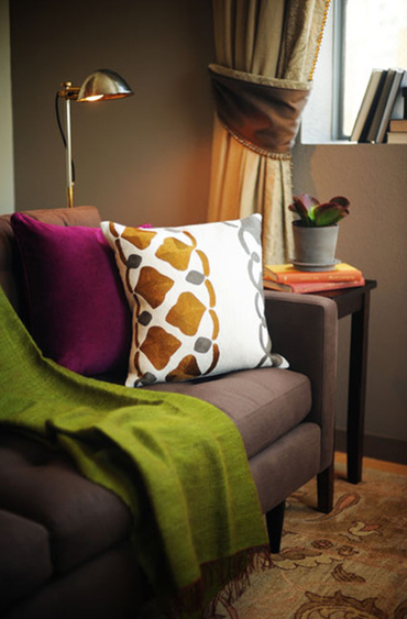
Pillows. Pillows (and the occasional throw blanket) are one of my favorite noncommittal ways to add a variety of colors to a space, for a few reasons: They’re easy to mix and match, they add small hits of color, and they’re easy to rearrange or replace at any time. Tired or overwhelmed by your look? Simply move a pillow to another room or change out the cover until your whims are satisfied.
Michelle Miller Interiors
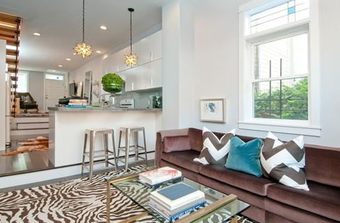
Pattern. Speaking of fabrics, bringing in some playful patterns is another way to add a sense of drama even where very little color is actually present. Look to bold geometrics (like a chunky chevron or stripe), animal prints and bold wood grains to add visual variety without clashing.
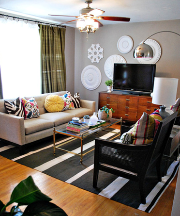
Combining patterned pieces with those in a combination of neutral tones (and some metallics) can create a colorful-feeling space with very little color at all.
Notice how in this space, besides the leafy greens, the only other bright hues are found in small doses in the pillow fabrics, and yet the overall effect is that of a rich and varied palette — totally livable but thoroughly colorful.
Source: Houzz
The 53rd Jinhan Fair
Jinhan Fair Online Exhibition


 Visitor Registration
 Booth Application