


Taste a Rainbow: 11 Top Home Decorating Colors and How to Use Them
2015.01.08
You might love color; you might hate it. Beige could be the most used color in your apartment, or a stack of gray paint chips could make you cringe. No matter how you feel about color, there are endless ways to use it to make over a space, create a mood and solve design dilemmas. Whether you like to go neutral or neon, Houzz' guides to color have you covered for the spring painting season.
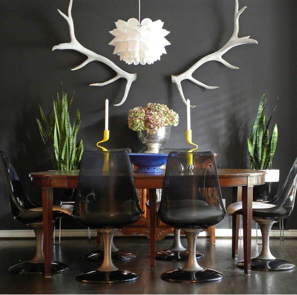
Gray. It was touted as a trend at first, but the love for gray has yet to fade. Play with dark charcoal for dramatic dining rooms and use foggy gray for relaxing bedrooms full of natural light.
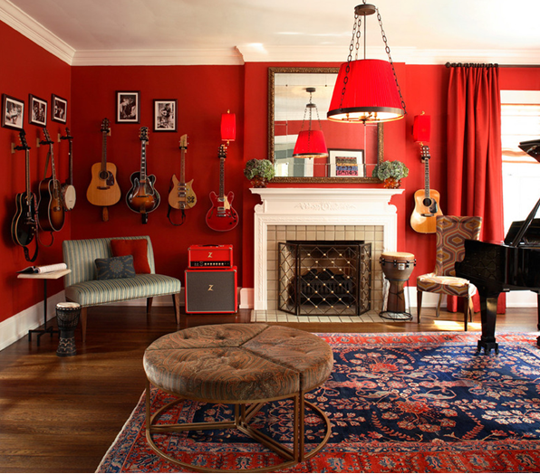
Red. Go beyond the classic red front door and bring this bold hue inside. Make an impact with an incredible accent wall or keep things simple with a few striped pillows.
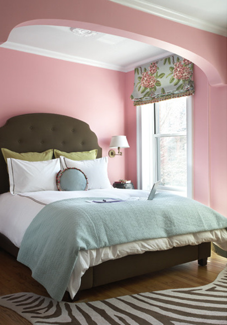
Pink. Although it's a favorite choice for little girls' rooms, pink can still feel grown up and sophisticated. This cheerful hue can brighten rooms of many styles.
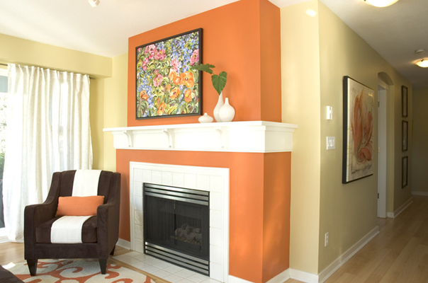
Orange. An often-forgotten color, orange can instantly warm up a room in even the subtlest accents. From tangerine to coral, a shade of orange can work in your home.
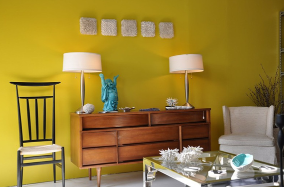
Yellow. Yellow is one of those colors that instantly makes people happy. Accent it with bright blues for a palette that plays off the color wheel, or tone it down by pairing it with gray and neutral textiles.
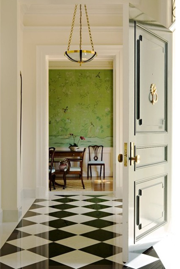
Green. Bring the outdoors inside with nature's favorite color. Lively, refreshing and eye catching, the right tone of green can work in any home.
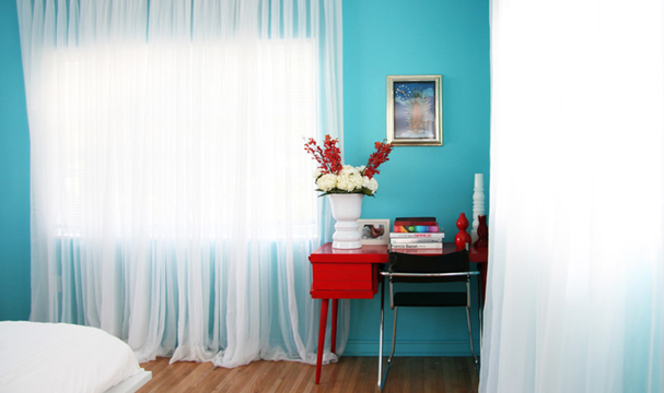
Blue. Bright and striking in some spaces, subdued and soothing in others, blue can completely transform a space.
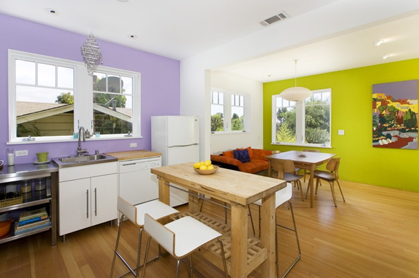
Purple. Purple isn't always the first choice for interior decorating — outside of children's spaces — but when used smartly and sparingly, it can add an elegant element of surprise to modern or traditional spaces.
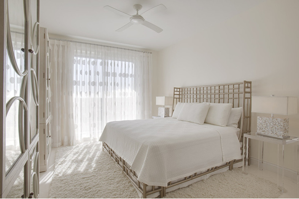
White. Sometimes sticking to the basics is your best bet. Don't dismiss white as boring — when used right, it can make an incredible statement.
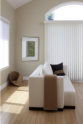
Brown. Although beige tends to get a bad rap, there's a reason this color is so popular: It's hard to get wrong. Use a lighter shade for more soothing spaces and venture into dark chocolate browns to mix things up.
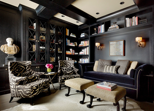
Black. Black doesn't have to be used sparingly. Although it's dark, it can often be used in the same way as a neutral but with a more dramatic flair.
Source: houzz.com
About JINHAN FAIR
JINHAN FAIR for Home & Gifts(Poly Spring/Autumn Fair Phase Ⅱ) is a leading international trade platform organized by Poly Exhibition. Established in 2000, JINHAN FAIR has been successfully held for 53 editions and is recognized as one of China's most established sourcing fairs for the home and gifts industry. JINHAN FAIR is also the only Union of international Fairs-approved export trade fair in the home & gifts sector in China.

The 54th Jinhan Fair
Jinhan Fair Online Exhibition


 Visitor Registration
 Booth Application