


Cool Color Palettes: Enviable Green and Blue Spaces
2014.08.22
We may be transitioning from summer to fall, but I’ve seen no let-up in the popularity of green and blue hues in homes. That’s because while they don’t scream autumn, they do form an excellent palette for those looking to inject color into a space without going too chroma crazy. This is because blue and green are adjacent on the color wheel. They blend and harmonize well due to their similarity to each other. What I also like about these colors is that you can bring in superpale shades of them without resorting to sugary pastels — just be sure to select a shade that has a good bit of gray. Here are six sensational spaces where this color combination works beautifully, along with paint palettes inspired by each room.
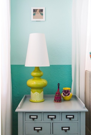
1. Retro Aqua and Lime
This aqua and lime color palette has a cool retro vibe.
Use the bolder shades sparingly, as was done here, if you want a more toned-down look.
The pale aqua shade is a great alternative to white, and if used as the main color in the space, it will help the room feel light, bright and open.
Then work in layers of bolder greens and darker aqua shades, which will offer contrast while still harmonizing with the paler aqua.
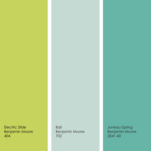
Example palette: Get a similar look with Electric Slide, Bali and Juneau Spring, all from Benjamin Moore.
Note: Due to differences in how interiors are lit and photographed, as well as how computer monitors are calibrated, the colors you see in these swatches and photographs may differ slightly from the actual colors. Always do a reality check and view actual paint swatches from the manufacturer, or better yet, evaluate a large paint sample of the color you are considering, before finalizing your selection.
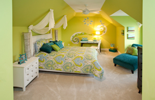
2. Tropical Greens and Blue
Tropical greens are such happy hues, making them perfect for a bedroom, especially one in a cold or gloomy climate. This wall color has a good bit of yellow, making it a terrific choice to brighten up a room that lacks abundant natural light. Add hints of greenish-blue for a bit of contrast.
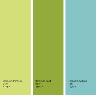
Example palette: Get a similar look with Carolina Parakeet, Bamboo Leaf and Embellished Blue, all from Behr.
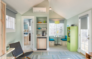
3. Neutralized Tones
Not a fan of bright and bold colors? Not a problem. Instead go for a neutralized blue or green — a lighter shade that has a good bit of gray. You can then add small bits of a more assertive color. Think about using the stronger hues to emphasize interesting furnishings, artwork or architectural details.
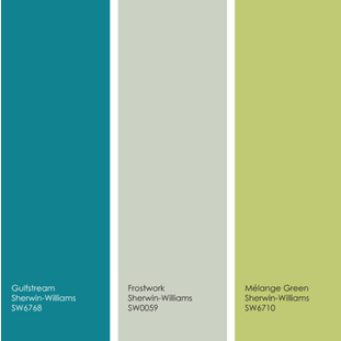
Example palette: Get a similar look with Gulfstream, Frostwork and Mélange Green, all from Sherwin-Williams.
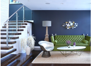
4. Ink and Grass
I really dig this dark, ink-blue accent wall, but it’s a tough color to pull off. Here it offers the perfect backdrop to the beautiful grass-green sofa. This room appears to get a good amount of natural light, and there is also plenty of white, as well as other light shades, to keep it from appearing cave-like or gloomy.
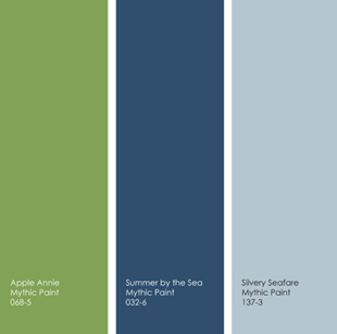
Example palette: Get a similar look with Apple Annie, Summer by the Sea and Silvery Seafare, all from Mythic Paint.
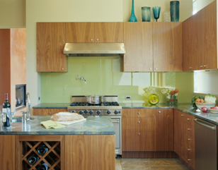
5. Green and Gray-Blue
Give your kitchen walls a delectable shade of green, then pair it with a more neutral gray-blue countertop. Add a few dashes of a bolder blue or green via decorative accents or accessories to help move the eye around the room. By sticking to neutral hues for materials that are more expensive to replace, such as cabinets, flooring and countertops, you can more affordably update your kitchen down the road by simply switching out accessories and paint colors.
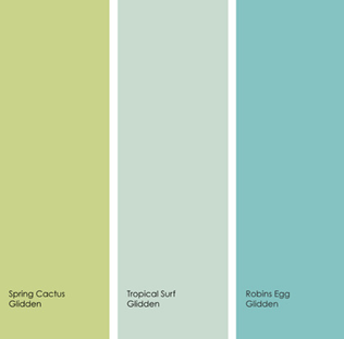
Example palette: Get a similar look with Spring Cactus, Tropical Surf and Robins Egg, all from Glidden.
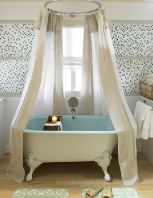
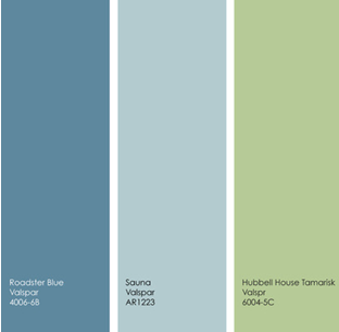
6. Cooler Hues
This gorgeous bathroom is covered mostly in white and light wood, but the small additions of soft sky blue, darker denim and fresh, herbaceous green add a nice splash of color.
These cool hues are among my favorites for bathrooms, because they create such a soothing vibe. And this is another example of how to use color in a more restrained way.
Stick to just two or three accent colors and sprinkle them in small amounts throughout the space. Yes, there’s color here, but it doesn’t smack you sideways with intensity.
Source: Houzz
About JINHAN FAIR
JINHAN FAIR for Home & Gifts(Poly Spring/Autumn Fair Phase Ⅱ) is a leading international trade platform organized by Poly Exhibition. Established in 2000, JINHAN FAIR has been successfully held for 53 editions and is recognized as one of China's most established sourcing fairs for the home and gifts industry. JINHAN FAIR is also the only Union of international Fairs-approved export trade fair in the home & gifts sector in China.

The 54th Jinhan Fair
Jinhan Fair Online Exhibition


 Visitor Registration
 Booth Application