


Seeing red in a new light
2014.05.22
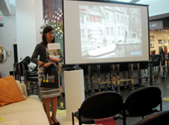
Sherwin-Williams' Carolyn Noble presented a seminar on the color red at the Surya showroom during the April 5-10 High Point Market.
During the January Las Vegas Market, Laurie Pressman from the Pantone Color Institute discussed the influence of color.
In High Point, Carolyn Noble, designer marketing manager of the Southeast Division for Sherwin-Williams, opted to focus on the power of red.
Noble’s presentation, “Seeing Red,” took place in Surya’s Showplace 4100 showroom on April 8 during the High Point Market, tying it all together with a quote from Diana Vreeland: “Red is the great clarifier – bright and revealing. I can’t imagine becoming bored with red; it would be like becoming bored with the person you love.”
Noble noted that red isn’t necessarily the next big hot color, but one that’s always in style. And, she said, it’s one that gets a reaction early in life.
“Red is the first color – after black and white – that babies see. Second to blue, it’s the world’s second most favorite color,” Noble said.
Beyond the crib, red, Noble noted, continues to generate powerful responses.
“According to a study published in the American Psychological Association Journal, when humans are exposed to red, our reactions become faster and more forceful,” she said. “Using collegiate aged kids and handgrips, on a computer screen, there would be in gray, blue or red, a prompt to squeeze. When the red (prompt) was shown, the response was quicker and harder.”
Plus, the shade has many powerful associations.
“An interesting study was done in Great Britain. Four green stop signs were placed in an intersection and the majority of drivers did not stop,” Noble recalled. “When drivers were interviewed and asked why they kept going, they answered that the sign was green.”
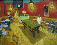
Vincent van Gogh's "The Night Cafe" juxtaposes red and green to stir the emotions.
Historically, red has been in use in art since around 170,000 BC when pigments were extracted from sources including madder plants and crushed, dried cochineal beetles (which also, until recently, provided the color of red tea for some popular beverage establishments).
Noble said civilizations have viewed red as a color of power (Egyptians, Chinese, Romans), have given it religious connotations (Roman Catholicism) or co-opted it in political movements (the French Revolution, USSR, China again).
In art, Noble said Vincent van Gogh was among the first notable artists to incorporate red as more than just an afterthought.
“From his example in the Night Café in letter to his brother, Theo: ‘I sought to express with red and green the terrible human passions. The walls are blood red and pale yellow with a green billiard table in the center. The lamps are lemon yellow, orange and green. Everywhere is a battle and antithesis of the most opposite reds and greens,’” she said.
Another example of an artist making the most of red is Henri Matisse, whose “The Dessert: Harmony in Red” exudes dynamism from its dominant color.
“Matisse was the first to use variations of cadmium red and mars red not only as the primary color but as the central theme,” Noble said.
Noble also showed a number of well-known brands that use red in their primary logo, which she said represents boldness and excitement.
Toward the end of the presentation, Noble showed images of neutral shaded rooms. With a click, the décor gradually reddened, creating a more vigorous and energetic setting.
And it’s that energy and vitality that makes red a mainstay in the home furnishings industry.
Source: home accents
About JINHAN FAIR
JINHAN FAIR for Home & Gifts(Poly Spring/Autumn Fair Phase Ⅱ) is a leading international trade platform organized by Poly Exhibition. Established in 2000, JINHAN FAIR has been successfully held for 53 editions and is recognized as one of China's most established sourcing fairs for the home and gifts industry. JINHAN FAIR is also the only Union of international Fairs-approved export trade fair in the home & gifts sector in China.
The 54th Jinhan Fair
Jinhan Fair Online Exhibition


 Visitor Registration
 Booth Application