


Pantone reveals 2016 color trends for interiors
2015.07.17
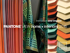
Pantone View Home + Interiors 2016 – Innovation and Impact includes nine key palettes, plus individual color and material direction, for home furnishings and interior design in 2016.
“As media continue to move toward more evocative, imaginative and innovative uses of color to woo consumers, unexpected color stories are emerging,” said Leatrice Eiseman, executive director of the Pantone Color Institute. “To capture attention and keep product lines relevant in the consumer’s eye, it’s important to understand the impact that this always-morphing innovation will have on color and design trends for 2016.”
Pantone View Home + Interiors 2016 contains visual inspiration, suggested color harmonies, individual tear-out palette cards for each of the nine forecasted palettes, swatches of the 77 forecasted colors and product imagery for use in presentations and storyboards. A summary page provides a comprehensive color overview and a look at other factors influencing the world of home furnishings and interior environments. To enable digital design, Pantone View Home + Interiors 2016 also includes Pantone Color Manager for direct download of all Pantone Color Libraries into design software.
The nine palettes for 2016 are:
Unambiguous colors, including shades that are plumbed from natural sources such as warm rosy clay and sheepskin beige, give us Natural Forms.
Dichotomy reinforces the concept that opposites do and can attract as silver metallic, sunny yellow and bright cobalt blue combine with calmer versions of the hues.
Pastel-focused Ephemera blends delicate shades of wan blue, pale peach and tender yellow.
Lineage is a palette where shades of navy, black, tan and regimental green co-mingle with touches of brighter colors.
Soft Focus reveals subtle and/or muted colors, sometimes being described as “smoky” and always versatile.
In the French language, Bijoux means “jewelry” – a fitting title for this palette that gleams with drama and intensity across many jewel tones.
Merriment is full of joyful shades including vibrant greens and yellows contrasted with pinks and oranges.
Capricious color combinations with vacation-destination blues and blue-greens create Footloose – a palette that supports the idea of throwing off the constricting scheduling of everyday life and simply enjoying the freedom of the outdoors.
Mixed Bag is an assortment of eclectic patterns and prints, with exciting and unique colors like pirate black and mandarin red as well as violet and florid orange.
Source: Home Accents Today
The 49th Jinhan Fair
Jinhan Fair Online Exhibition


 Visitor Registration
 Booth Application